📏 EM to PX Converter
Convert em units to pixels and back — enter your base font size for accurate results
| EM Value | Base 14px | Base 16px | Base 18px | Base 20px |
|---|---|---|---|---|
| 0.5em | 7px | 8px | 9px | 10px |
| 0.625em | 8.75px | 10px | 11.25px | 12.5px |
| 0.75em | 10.5px | 12px | 13.5px | 15px |
| 0.875em | 12.25px | 14px | 15.75px | 17.5px |
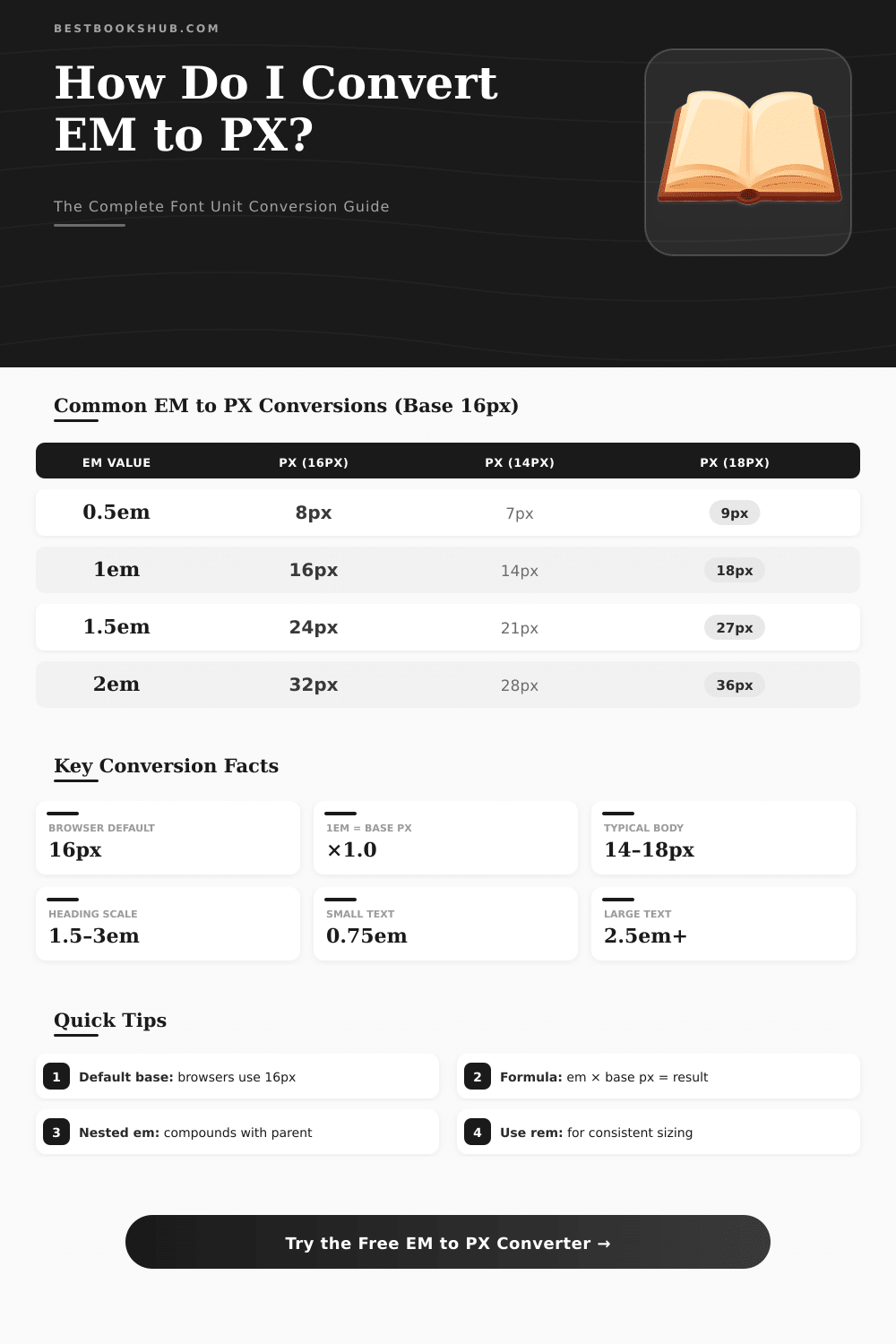
| 1em | 14px | 16px | 18px | 20px |
| 1.125em | 15.75px | 18px | 20.25px | 22.5px |
| 1.25em | 17.5px | 20px | 22.5px | 25px |
| 1.5em | 21px | 24px | 27px | 30px |
| 2em | 28px | 32px | 36px | 40px |
| 2.5em | 35px | 40px | 45px | 50px |
| 3em | 42px | 48px | 54px | 60px |
| 4em | 56px | 64px | 72px | 80px |
| Pixels (px) | EM @ 16px | REM @ 16px | Pt (72dpi) | Pt (96dpi) |
|---|---|---|---|---|
| 8px | 0.5em | 0.5rem | 6pt | 8pt |
| 10px | 0.625em | 0.625rem | 7.5pt | 10pt |
| 12px | 0.75em | 0.75rem | 9pt | 12pt |
| 14px | 0.875em | 0.875rem | 10.5pt | 14pt |
| 16px | 1em | 1rem | 12pt | 16pt |
| 18px | 1.125em | 1.125rem | 13.5pt | 18pt |
| 20px | 1.25em | 1.25rem | 15pt | 20pt |
| 24px | 1.5em | 1.5rem | 18pt | 24pt |
| 28px | 1.75em | 1.75rem | 21pt | 28pt |
| 32px | 2em | 2rem | 24pt | 32pt |
| 36px | 2.25em | 2.25rem | 27pt | 36pt |
| 48px | 3em | 3rem | 36pt | 48pt |
| 64px | 4em | 4rem | 48pt | 64pt |
| 72px | 4.5em | 4.5rem | 54pt | 72pt |
| 96px | 6em | 6rem | 72pt | 96pt |
| Step | Scale Ratio | PX Value | EM Value | Typical Use |
|---|---|---|---|---|
| -2 | 0.694 | 11.11px | 0.694em | Fine print / caption |
| -1 | 0.833 | 13.33px | 0.833em | Small / supporting text |
| 0 | 1.000 | 16.00px | 1em | Body text (base) |
| +1 | 1.200 | 19.20px | 1.2em | Large body / intro |
| +2 | 1.440 | 23.04px | 1.44em | H3 heading |
| +3 | 1.728 | 27.65px | 1.728em | H2 heading |
| +4 | 2.074 | 33.18px | 2.074em | H1 heading |
| +5 | 2.488 | 39.81px | 2.488em | Display title |
| +6 | 2.986 | 47.78px | 2.986em | Hero display |
em is relative to the parent element’s font size, so nested elements compound. rem is always relative to the root (html) element — usually safer for consistent sizing across your layout.html { font-size: 62.5%; } your base becomes 10px, making 1.6rem = 16px which many developers find easier to work with mentally.The convert of px to em works like this, as one promises, it is a real tool, that switches between pixels and em-values, two units, that you will use often while you write CSS-code. It counts quickly and cares about the math, so you do not need to. Whether you use Windows, Mac or Linux.
DISCLOSURE: This post may contain affiliate links, meaning when you click the links and make a purchase, I receive a commission. As an Amazon Associate I earn from qualifying purchases.
That does not matter. Chrome, Firefox, Edge Safari. Everything works well.
Easy way to convert px and em
The program simply works in your browser.
Here the key point about convert between em and px: you need to know what is your basic font size. In web design this base usually sits on the html- or body element. The most many browsers come with default value of 16 px, although users can change that in their settings, or you can set it with your CSS.
Convert pixels to em-units comes down to one easy step. One first finds out how much one em really means. Normally 16 px.
Later one divides the pixel value by that number. So, if you have 32 px and one em maches 16 px, result 2 em. The reverse math is also easy.
Want to go of em to pixels? Multiply the em-value by your base. Two em with 16 px base?
It makes 32 px.
Various tools offer different features. Some allow to switch between four main CSS-units for font size: px, em, pt and percentages. Others add a custom parent font size, quick links for fast searches and live calculators.
Some even make a whole convert table, when you enter your body font size in pixels.
Start to use such tools is really easy. Type your px-value, press enter or click button, and their it is, your em-number. Many tools work in both directions.
Put em-value in one box and watch, as the matching pixel value appears in the other, without any button click.
But here where it gets interesting: pixels and em-units are not really same kind of unit. Convert between them not always is simple. Consider a case, where your main title is set to 200-percent font size.
With default 16 px that means, that one em could be 32 px for that title.
Em-units are relative to any parent element, in which they are nested. In complex design with nested em-units everything soon becomes hard, each em counts based on the font size of its own parent. The most many developers fix that, setting basic font size on the html- or body element, so each em-calculation has firm base.
Em-units work well for flexibility, but in practice you often mix px and em together, to get the wanted control. What method best works? Use px for elements, that never should change size.
Borders, shadows, such things. Use em, when you want, that something grows with its parent. And use rem forconsistent design, where everything adapts to the root font size.