🔤 Kerning Calculator
Calculate precise letter-spacing & kerning values for any font size or typographic context
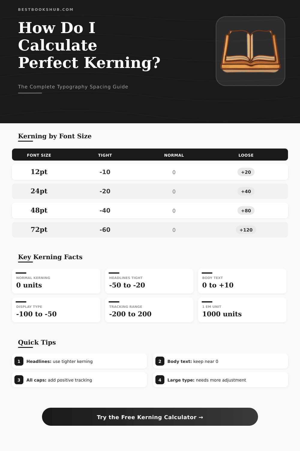
| Font Size | Context | Recommended Kerning (em) | Tracking (em) | Line Height |
|---|---|---|---|---|
| 8–10pt | Footnote / Caption | +0.08 to +0.12 | +0.10 | 1.4–1.6 |
| 11–13pt | Body Copy | 0 to +0.02 | 0 to +0.02 | 1.4–1.5 |
| 14–18pt | Large Body / Lead | –0.01 to +0.01 | –0.01 | 1.3–1.5 |
| 20–28pt | Subheading | –0.02 to –0.01 | –0.02 | 1.2–1.35 |
| 30–48pt | Heading | –0.03 to –0.02 | –0.03 | 1.1–1.25 |
| 50–72pt | Display / Hero | –0.05 to –0.03 | –0.05 | 1.0–1.15 |
| 80–120pt | Large Display | –0.08 to –0.05 | –0.07 | 0.95–1.1 |
| 120pt+ | Poster / Signage | –0.10 to –0.08 | –0.10 | 0.9–1.0 |
| Em Value | At 12pt (px) | At 16pt (px) | At 24pt (px) | At 48pt (px) | At 72pt (px) |
|---|---|---|---|---|---|
| –0.10em | –1.2px | –1.6px | –2.4px | –4.8px | –7.2px |
| –0.05em | –0.6px | –0.8px | –1.2px | –2.4px | –3.6px |
| –0.02em | –0.24px | –0.32px | –0.48px | –0.96px | –1.44px |
| 0em | 0px | 0px | 0px | 0px | 0px |
| +0.02em | +0.24px | +0.32px | +0.48px | +0.96px | +1.44px |
| +0.05em | +0.6px | +0.8px | +1.2px | +2.4px | +3.6px |
| +0.10em | +1.2px | +1.6px | +2.4px | +4.8px | +7.2px |
| +0.15em | +1.8px | +2.4px | +3.6px | +7.2px | +10.8px |
| Em Value | CSS letter-spacing | Figma (per 1000) | InDesign (per 1000) | Illustrator (per 1000) |
|---|---|---|---|---|
| –0.10em | letter-spacing: -0.1em | –100 | –100 | –100 |
| –0.05em | letter-spacing: -0.05em | –50 | –50 | –50 |
| –0.02em | letter-spacing: -0.02em | –20 | –20 | –20 |
| 0em | letter-spacing: 0 | 0 | 0 | 0 |
| +0.05em | letter-spacing: 0.05em | +50 | +50 | +50 |
| +0.10em | letter-spacing: 0.1em | +100 | +100 | +100 |
| +0.15em | letter-spacing: 0.15em | +150 | +150 | +150 |
If you design anything with text for the net, a kerning calculator becomes almost necessary. Those programs allow you to play with the spacing between letters in real time and generate the CSS code you need for excellent kerning of text in your net projects. In addition, they have a handy converter built in that takes values of kerning from Photoshop and changes them to CSS letter-spacing which saves a lot of time while you move designs from Photoshop to a working website
DISCLOSURE: This post may contain affiliate links, meaning when you click the links and make a purchase, I receive a commission. As an Amazon Associate I earn from qualifying purchases.
Kerning is basically about controlling the spaces between certain pairs of letters. Occasionally the default kerning that comes with the font simply does not work for some combinations, so you must fix them manually so that the whole text looks good. Here is the key point though, kerning is genuinely about sight.
Simple Kerning Tips for the Web
You do not measure actual distances, but perceive the spaces between letters, which is an entirely diffrent thing.
The main goal is that the signs feel equally spaced. Even tiny changes can seriously alter the look of the text on the page. Letters like A and V have a bad name in kerning circles.
Papyrus also, honestly. Usually you do not need to touch the kerning; signs with a lot of white space around them, like A and V, benefit from being closer to feel visually balanced.
Metrics kerning bases on kern pairs, which work with most fonts. Those pairs have preset spacing info for specifics like LA, P., To, Tr, Tu, Te, Ty, Wa, WA, VA, Ya, We and many others. Optical kerning works differently.
It appears in more professional design programs. The algorithm analyzes the forms of letters and counts ideal spacing for every next pair. Unless you work with a huge amount of text, simply choose “Optical” and you will receive good results without manual work.
While kerning, always compare quickly with the default spacing of the font. A good test is to put a kern pair like AV between two Ns, two Hs or two Os. If the A-to-V combination looks visually balanced with the surrounding spacing, it is good.
Another easy way is to zoom in on three letters, center the middle one visually and later go through the pairs one by one.
Except basic kerning, there are advanced tools that group signs, find all missing pairs and apply intelligent kerning to the whole font or only a subgroup, for instance capital or lowercase letters. KernType, a game from Method of Action, helps you train and sharpen your eye. An important note is that good kerning must be optical, not mechanical.
Many free fonts have weak spacing built in, so kerning suffers already fromthe start.