🔤 Uppercase conversion studio
Text to uppercase converter
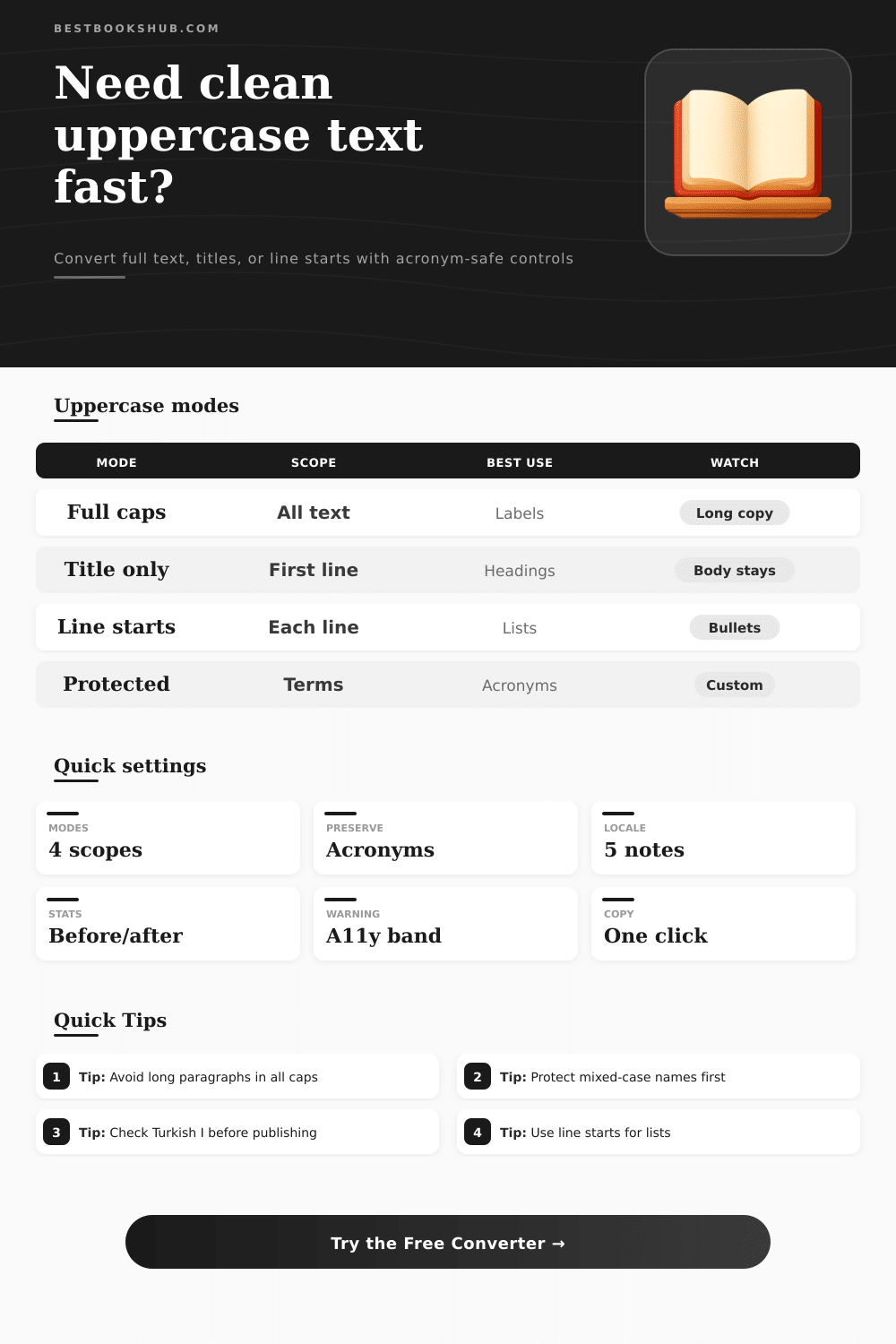
Convert full text, just the title, or the starts of each line while preserving acronyms, checking locale-sensitive casing, and reviewing before-and-after case stats.
Choose a realistic editing scenario, then fine-tune the uppercase scope, acronym protection, locale note, and accessibility threshold.
DISCLOSURE: This post may contain affiliate links, meaning when you click the links and make a purchase, I receive a commission. As an Amazon Associate I earn from qualifying purchases.
Paste text and choose whether uppercase should affect everything, only the title area, or the first word of each line. Locale notes explain casing edge cases without changing your whole page.
Use these references to choose a scope, protect special terms, and avoid long all-caps copy that may reduce readability.
| Scope | What changes | Best for | Risk |
|---|---|---|---|
| Full text uppercase | Every eligible letter | Short labels | Harsh for paragraphs |
| Title only uppercase | First title segment | Book headings | Wrong boundary |
| Line starts uppercase | First line cue | Lists and tabs | Partial emphasis |
| Sentence first words | Sentence openings | Editorial review | Needs punctuation |
| Locale | Case note | Example issue | Best check |
|---|---|---|---|
| Default | Browser rules | Mostly English | Fast labels |
| English | Standard Latin | i to I | US metadata |
| Turkish | Dotted I differs | i to uppercase I variant | Names and places |
| German | Sharp S may expand | ss or capital sharp S | Proof terms |
| Protection | Example | Converter role | When useful |
|---|---|---|---|
| Acronym detection | ISBN, DOI, SEO | Counts and keeps | Metadata copy |
| Custom term | iPhone, eBay | Exact preserve | Brand casing |
| Mixed acronym | ePub, PDF/A | Manual list | Publishing files |
| Known code | API, HTML | Force uppercase | Technical notes |
| Warning band | Trigger | Meaning | Adjustment |
|---|---|---|---|
| Low | Short labels | Usually safe | Use as-is |
| Medium | Long title/list | Review scan | Shorten text |
| High | All-caps body | Harder to read | Use title only |
| Manual | Protected terms | Check casing | Proof names |
Capital letters conveys authority to the reader. Using capital letters in specific places within the text is beneficial. However, using capital letters throughout an entire page are detrimental to the reading experience of the reader.
Using capital letters throughout a long passage of text will cause a person to scan the text less effectivly. Additionally, a person’s eyes will tire more quickly when reading text in which every letter has the same weight. In order to effectively use capital letters within a piece of text, a person must understand when to use capital letters and when to avoid using them.
When to Use Capital Letters
The converter allow a person to control the boundary of the use of capital letters. Using the converter, a person can limit the use of capital letters to only being used in a title line or only being used in the first word of a list item. Additionally, a person can also limit the use of capital letters to only being used at the beginning of a sentence in a project.
Many projects will only require the use of capital letters at the beginning of each sentence. Use capital letters for a catalog entry, a tab label, or a section heading. The body text of the passage will not be converted into capital letters.
A person can also protect certain terms within the document that should not be converted into capital letters. By protecting certain terms, people ensures that brand and product names, acronyms, and titles that use mixed capital letters will maintain its original identity. If these terms are not protected, the users will lose there original identity as all of the letter within those terms will be converted to uppercase.
Not all languages treats there letters in the same way when converting to uppercase text. For example, Turkish language considers any text that has a dotted “i” and text that has a dotless “i” as two separate letters. The difference between these two form of the “i” can change the spelling of certain proper names.
German text also treats the sharp “s” differently than most other language; it can either expand into two “s” characters or it can remain as a sharp “s” depending on the font and web browser in which the text is viewed. By using the correct locale for a language, capital letters will be correctly applied to that language. Using the correct locale note allow you to find these edge cases prior to the text reaching the reader.
Finding these edge cases early in the project will allow you to avoid having to make major correction later to the project. The length warning is based off the idea that blocks of uppercase text work best when the word count of that block of text is small. While the length warning does not forbid the use of blocks of uppercase text of a long length, the length warning will alert the user as to potential difficulty that the reader will experience with very long blocks of uppercase text.
Thus, the author is aware of the length of the text that must be converted and can choose to either switch to title-only mode or to stick with converting all text to uppercase if that is the requirement of the project. Different projects has different requirements for the use of uppercase text. For instance, one project may contain a press release that has uppercase text only for its headline, while another project may use an index tab in which only the first word of each line is capitalized.
Other projects may have metadata fields that contain acronyms and product names that should not be changed from there current format. These different situations can be matched with the settings in the converter. The most important habit to develop when utilizing this tool is to determine the purpose for which the uppercase text will be used in the project.
If the goal is to provide visual separation of elements on a page, then a narrow scope and protected terms will help to achieve that goal. If the goal is to create a formal tone to a label or sign, then full uppercase text of a short length should of been used. These different choice will become visible to the users as they work with the tool, and the final output will match the intent of the users.