🖼 Accessible image text lab
Alt text length checker
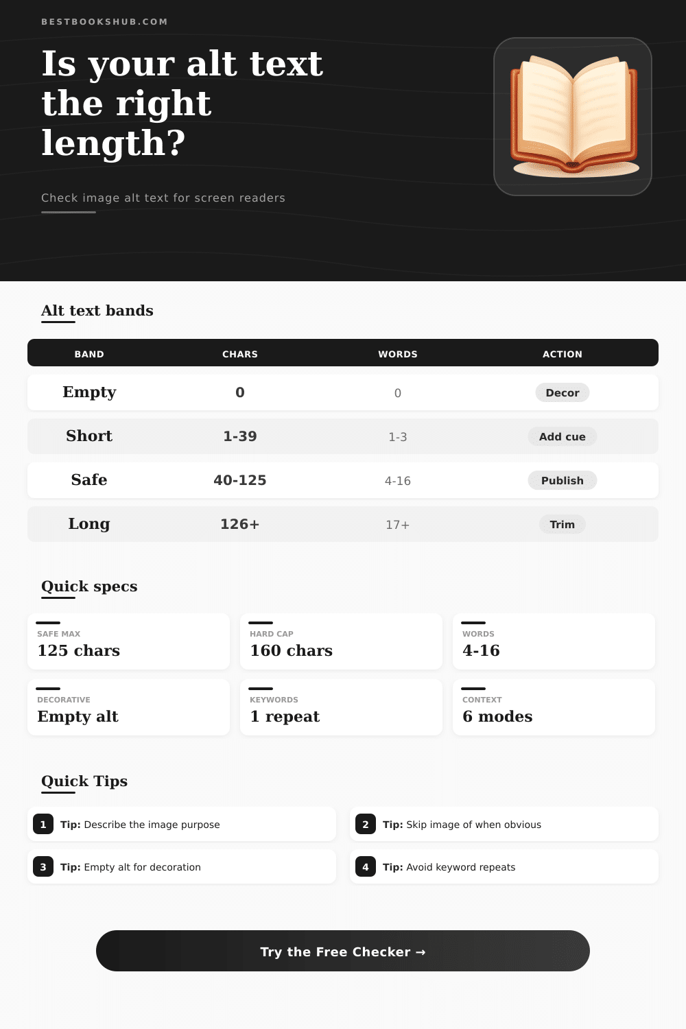
Check image alt text for character count, descriptive word count, context fit, keyword stuffing risk, decorative image handling, and a screen-reader-safe range.
| Band | Character range | Word signal | Screen reader effect | Recommended action |
|---|---|---|---|---|
| Empty | 0 characters | No words | Correct only when the image is decorative or redundant. | Use empty alt for decoration; otherwise write a concise description. |
| Very short | 1-39 characters | Often 1-3 words | May miss the image purpose or important visible detail. | Add the subject plus one page-relevant detail. |
| Screen-reader safe | 40-125 characters | Often 4-16 useful words | Usually concise enough to announce without slowing navigation. | Publish if context, purpose, and wording are natural. |
| Detailed but long | 126-160 characters | Often 17-24 words | Can work for complex images, but may feel heavy. | Move excess detail into a caption or surrounding copy. |
| Overextended | 161+ characters | Often paragraph-like | May burden screen reader users and hide the key point. | Trim to the takeaway or provide a separate long description. |
| Image context | Recommended range | Include | Avoid | Example focus |
|---|---|---|---|---|
| Informative editorial | 40-125 chars | Subject plus relevant detail | Repeating nearby caption | Reader holding a marked paperback. |
| Book cover | 35-110 chars | Title and visible cover cue | Full design critique | Cover of a novel with blue city skyline. |
| Product or object | 45-125 chars | Object, format, key visible trait | Sales language | Black adjustable book stand on a desk. |
| Chart or graph | 60-160 chars | Main takeaway | Every data point | Bar chart showing ebooks outpacing print. |
| Screenshot | 45-140 chars | Screen name and user task | Every button label | Library app search results screen. |
| Linked image | 30-90 chars | Action or destination | Only visual decoration | Open the downloadable reading tracker. |
| Decorative | 0 chars | Empty alt attribute | Filler description | alt="" for ornamental divider. |
| Signal | Checker threshold | Why it matters | Better edit | Result |
|---|---|---|---|---|
| Exact phrase repeats | Above selected cap | Alt text can sound like SEO copy instead of description. | Use the phrase once, then describe visible detail. | More natural announcement. |
| High density | Over 25% phrase density | The same words dominate the short text. | Replace repeated nouns with specific visual cues. | Less repetitive wording. |
| Repeated descriptive word | Same word 3+ times | Repetition reduces useful information per word. | Keep one strong noun and cut duplicates. | Sharper alt text. |
| Generic prefix | Image of or photo of | Screen readers already identify an image in many contexts. | Start with the subject unless the medium matters. | Faster announcement. |
| Image role | Alt attribute | When correct | When wrong | Checker cue |
|---|---|---|---|---|
| Pure decoration | alt="" | Divider, texture, flourish, spacer, repeated icon. | Image contains unique information or a link. | Decorative mode expects 0 characters. |
| Redundant image | alt="" | Adjacent text already gives the same information. | The image adds meaning not stated nearby. | Nearby context can support empty alt. |
| Functional image | Action text | Image is a button, link, or control. | Alt only describes colors or shape. | Linked context expects action wording. |
| Informative image | Concise description | Image teaches, identifies, summarizes, or clarifies. | Alt is blank or only says graphic. | Normal mode expects useful words. |
DISCLOSURE: This post may contain affiliate links, meaning when you click the links and make a purchase, I receive a commission. As an Amazon Associate I earn from qualifying purchases.
This tool lets you know how many characters it’s taking up and how many words are in the description. It shows if it fits in context and if its a decorative image or not. It also shows how many times a keyword is used and how well it’ll work on screen readers prior to posting an image.
Long descriptions for basic product photography is a source of confusion on screen readers. Sometimes, they’re skipped altogether and the user doesn’t realize that anything was missed. Alt text length are key here. If you nail it, you’re golden; if you don’t, you’re not. And the sweet spot is smaller then most believe it is.
How to Write Good Alt Text for Images
That’s the thing: The actual problem isn’t how many characters are being rendered, it’s knowing which ones matter to the user. Is it the same image used as a decorative divider versus a button? Different information are needed, such as a book cover. The same image, used in a review vs. Is it used on the cover of another book? It is also different. A chart containing sales data vs. It could be a decorative divider between two charts. It is also different. It depends entirely off context. And that’s why the tool allow you to specify what the image does on your page. That’s what matters and what gets stripped out.
Since screen readers reads alt text along with surrounding text, it can impact how easily users navigate. Alt text that is too short might not describe what’s being shown well, but longer alt text will make users have to listen through unnecessary information as well as slow down the reading flow. Accessibility pros tend towards the sweet spot of something between a brief sentence and a concise paragraph, the type of alt text you’d want to hear out loud to yourself. With this tool, when you input your draft, it figures out where the cut off should of be for you, eliminating the guesswork about where to draw that line.
The other issue is keyword stuffing. To help with SEO, writers may write in a phrase about products or brands too many times, but on an audio device, its super obvious if they’ve done this. A single naturaly reference tends to be enough. Anything more reads as marketing copy rather than description which is why most people don’t pick up on it. Density and exact repeats gets flagged by the tool so you can catch yourself before hitting publish.
These are special cases for decorative images. Sometimes you don’t have to announce every visual element. Purely decorative touches, ornamental rules, background textures often fare better without an alt attribute at all. That’s what the checker’s toggle for decorative mode is meant to indicate, where the right answer isn’t just “zero characters,” but that zero characters is indeed the right answer. And this is important in ways other people don’t consider.
The common errors gather in familiar spots. Don’t waste your alt text real estate by starting it out with something obvious, like “photo of” or “image of.” Screen readers announce that this is an image anyway. Generic stuff like that flattens the description and removes any special details you might have had to offer. Begin with the content itself. The thing (or action) depicted in the image that helps support what’s written around it.
The other common misstep is treating alt text as a caption. While captions are good things for everybody, alt text serve only one purpose: replace the image for people who can’t see it. In summary, pixel-oriented alt text is bad; purpose-oriented alt text is good. When writing alt text, always ask yourself: “What’s this image doing here?” Is it linking to something? Is it representing some kind of data? Describing a product? If you know what an image does on a page, then you can usually tell how long its alt text should be. Not too much. It should be just enough so that someone knows why the image was there in the first place.
To write good alt text is still half empathy and half craft. While the numbers assist, what really helps is making the habit of reading out loud whatever you have written. Does it sound naturaly as you say it? If so, then likely pretty good. If not, if it sounds like a wall of text or something read from a product listing, prune it back. Perfection in writing come after repeated iterations. You get closer each time.
What we strive for is that everyone who visits will walk away with a similar understanding of what’s on offer, no matter their method of experiencing your content. Get that right. One well-thought-out sentence of the right length ensures an image doesn’t just take up space, but tells us something about what is being shown.