📖 Prose layout calculator
White space ratio calculator
Estimate how open or crowded a prose page feels by accounting for margins, gutters, leading, paragraph gaps, ragged line endings, and unused text-frame space.
The calculator treats white space as page area not occupied by prose line boxes or visual material. It separately tracks margins, gutters, leading, paragraph gaps, ragged endings, and unused frame depth.
DISCLOSURE: This post may contain affiliate links, meaning when you click the links and make a purchase, I receive a commission. As an Amazon Associate I earn from qualifying purchases.
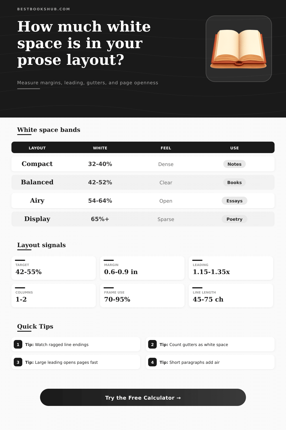
These reference ranges are practical layout-planning bands. They are best used to compare page openness, not to judge literary quality.
| White space band | Approximate ratio | Reader impression | Common prose use |
|---|---|---|---|
| Dense reference page | 30-40% | Compact, information-heavy | Indexes, notes, compact handouts |
| Balanced book page | 42-55% | Readable, steady, economical | Novels, nonfiction, reports |
| Comfortable essay page | 50-62% | Open and editorial | Essays, magazines, study pages |
| Display prose page | 62-75% | Spacious and deliberate | Openers, poetry-prose, feature starts |
| Trim or page | Typical prose margins | Usable frame share | Layout note |
|---|---|---|---|
| 5 x 8 paperback | 0.55-0.75 in | 64-72% | Small pages need disciplined line length. |
| 5.5 x 8.5 digest | 0.60-0.85 in | 62-73% | Flexible for fiction and nonfiction. |
| 6 x 9 trade | 0.65-0.90 in | 61-72% | Often supports larger type or wider margins. |
| A4 or letter handout | 0.75-1.10 in | 63-74% | Usually needs columns to avoid long lines. |
| Typography setting | White space effect | Useful range | Watch point |
|---|---|---|---|
| Leading | Raises internal vertical air | 1.10-1.35x | Too much leading can detach lines. |
| Paragraph spacing | Adds visible pauses | 0-8 pt | Stacked gaps can waste short pages. |
| Ragged right | Adds line-end air | 5-18% | Very short rags can look broken. |
| Column gutter | Adds central white channel | 0.15-0.35 in | Too narrow gutters merge columns. |
| Layout comparison | Strong signal | Likely ratio | Best adjustment |
|---|---|---|---|
| Overpacked page | Frame use near 100% | Under 38% | Increase margins, leading, or page count. |
| Even book spread | Line length 45-75 ch | 42-55% | Keep spacing stable across chapters. |
| Essay-style page | Wide margins and short blocks | 52-64% | Check that line endings still feel intentional. |
| Underfilled layout | Large unused frame depth | Above 68% | Reduce opener space or rebalance copy. |
Your layout isn’t simply empty paper you fill up with words; it’s a collection of active materials that includes white space. This space shape silence around the words on the page, creating rhythm. It guides the reader’s eye across document so they do not have to hunt for where one sentence ends and another begins. In designing a magazine essay or chapter of a book, you’re arranging these spaces as much as you’re arranging text.
After choosing your leading options, margin preferences and trim size, let the calculator do math for you. You won’t have to guess if your pages look too tight with narrow margins or tight line spacing. Leading is one of the best ways to open up a tight looking design without changing actual font itself. To make an otherwise cramped handout look like it’s easier to read, bump up the line spacing by ten percent. Although you haven’t actualy changed the width of your page dimensions, the perceived quality has improved greatly.
Why White Space Matters in Design
How do margins work? Not as most designers imagine. They are not just frames for the content inside; they signal tone: Is this voice trying to appear serious or casual? Are you meant to feel packed in by its half-inch margins, or treated like it’s a luxurios to spend time savoring every inch of the page? Depending on your book, those can represent a very different experience. The reference table illustrate why. Compact books tend toward 32-ish percent whitespace, whereas airy literary pages hit 60-plus percent. Neither is right or wrong, they’re just signaling entirely separate reading experiences to your audience before they even begin to read the words.
Paragraphs and gutters are complex, these is things new designers tend to ignore. When you create a two-column newsletter layout, don’t think that thin band of white separating those two columns is just dead space. That’s actualy a path that keeps the lines of text separated when quickly scanned across the screen. Paragraph spacing act as punctuation on a macro scale. A generous gutter signals to the reader that it’s time to take a breath and reset their mental model; multiple tiny gaps can appears choppy. There needs to be enough rhythm so your eye move easily down each line without stopping.
A page full of three-word paragraph, spaced far apart, won’t seem open. Instead, it’ll feel broken. In many situations, slight irregularity at line-ends makes reading easier: a bit of raggedness is okay. With justified text, the white spaces between words come out straight. These form vertical rivers of blank space that are actualy harder to read through than a slightly uneven edge. When using looser rag, words has room to breathe at line-ends, creating little bits of extra white that add up to real visual impact. It’s about feeling comfortabley when you read something long.
Also note any wasted space from the text frame depth. If your copy takes up just half the height of area inside your margin guidelines, then the other half, the bottom half, is also white space. That can happen on pages with brief final paragraphs or chapter openers. Failure to account for it leads to inaccurate estimates of how “full” a page actualy feels.
The point here is to create ratios to measure the physical appearance of your book against what it’s supposed to be: Is this the kind of book where the layout feel dense and compact? Should the text be wide open? You are aiming for a middle ground that feels consistent from one spread to the next. More than anything, try to avoid sudden changes. For example, do not let chapter three appears with half the amount of leading as chapter two for no good stylistic reason. Your gut tells you things, and the numbers will tell you if you’ve got it right. Let them back up what your eyes are already telling you.
In a good design, the white space serves and supports the noise so well that it becomes invisible. When you reach that place, the place where the whitespace feels necessary rather than empty, it’s not really whitespace anymore.