Lowercase Letter Counter and Checker
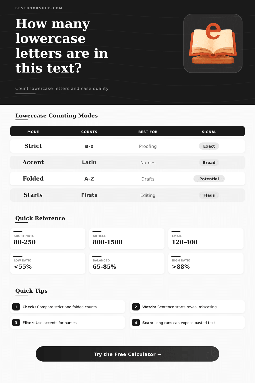
Measure strict lowercase use, alphabet coverage, repeated runs, and sentence-start case signals from one text sample.
📌Named Text Presets
🔧Lowercase Counting Controls
Paste paragraphs, labels, captions, snippets, or mixed-case drafts. The checker reads letters, words, sentences, and repeated lowercase runs.
📊Analyzer Spec Grid
📘Lowercase Profile Reference
| Profile | Lowercase Characters Counted | Best Fit | Checker Note |
|---|---|---|---|
| English a-z | 26 basic lowercase letters | English drafts, labels, navigation text | Most exact for ASCII-only audits. |
| Latin plus accents | Lowercase letters with Unicode case pairs | Names, multilingual snippets, imported copy | Counts accented lowercase as letters. |
| German-aware | a-z plus ae, oe, ue, sharp s forms | German names, addresses, short notices | Sharp s is treated as lowercase. |
| Turkish-aware | a-z plus dotted and dotless i forms | Turkish names and interface fragments | Separates i and dotless i signals. |
🔎Counting Scope Comparison
| Scope | Counts | Ignores | When To Use |
|---|---|---|---|
| Strict lowercase already present | Letters that are lowercase now | Uppercase letters and nonletters | Exact proofreading and validation. |
| Lowercase potential after case folding | Recognized letters after converting to lowercase | Numbers, punctuation, symbols | Planning normalized slugs or IDs. |
| Lowercase inside words only | Lowercase letters after the first token character | Opening letters and separators | Checking title case or label consistency. |
| Visible text, ignore bracketed notes | Lowercase outside square and round brackets | Editorial comments and aside markers | Cleaning drafts with inline notes. |
📏Benchmark Ratios By Text Type
| Text Type | Typical Lowercase Ratio | Common Flag | Review Target |
|---|---|---|---|
| Editorial paragraph | 68% to 86% | Too many acronym-heavy tokens | Balanced sentence case. |
| Headline and label set | 42% to 70% | Mixed title case rules | Consistent capitalization pattern. |
| Social caption | 60% to 88% | Repeated emphatic lowercase runs | Readable informal copy. |
| Technical note | 48% to 78% | Code, IDs, and version strings | Separate prose from identifiers. |
🔡Letter Shape Groups
| Group | Letters | Measures | Useful Signal |
|---|---|---|---|
| Vowels | a e i o u plus selected accents | Sound-heavy lowercase share | High values often mark natural prose. |
| Consonants | Lowercase letters outside vowel set | Structure-heavy lowercase share | Good for comparing dense labels. |
| Ascenders | b d f h k l t | Tall lowercase forms | Shows visual texture in headings. |
| Descenders | g j p q y | Below-baseline lowercase forms | Helpful for line-height checks. |
💡Checker Tips
All counts are calculated in the browser. The checker does not send pasted text anywhere.
DISCLOSURE: This post may contain affiliate links, meaning when you click the links and make a purchase, I receive a commission. As an Amazon Associate I earn from qualifying purchases.
Most writers don’t think of capitalization as a design decision, but rather do it by reflex. School trained them to put an uppercase letter at the beginning of each sentence and each proper noun. This is a good grammar rule, but it may not be best for readability or brand.
Case distribution changes things when you view your text this way. By running the math for you (see the counter above for the lowercase letters), it removes the noise so you can see what percentage of your text actualy relies on lowercase forms vs. Uppercase emphasis. Ones emphasizing uppercase. It’s a tiny metric, but it tells you a lot about texture and tone.
How Capital Letters Affect Your Writing Style
Here’s where most folks tend to stumble: the difference between folded potential vs. Strict counts. The latter simply tell you the raw count of lowercase letter existing in the text right this very moment. The former shows what would happen if we converted every letter to lowercase, thus ignoring capitalization style, so we can more easily observe the actual structure of letters. If the two counts wildly diverge, chances are good you’ve got some header-heavy text going on (e.g., using lots of all-caps or title case). It’s not wrong, but it’s a style choice that changes how fast or heavy the text feels to read.
If you deal with international clients or names, Alphabet profiles matter (more than you might think). With them, you can toggle between plain old English ASCII and wider Latin sets including accented characters such as ü or é. Those dashes make the difference: without accounting for them, your coverage stats will appear partial, since those letters aren’t actually included. And picking the correct profile guarantee that something written as José is considered completely lowercase, not marked as an outlier. It’s all about the precision of the measurement, not just its volume.
Long strings of lower-case letters reveal accidental formatting losses, or even that the text was copied and pasted. Rich-text formatting gets stripped out at times when you copy something from one platform and paste it into another, resulting in words glued together, or oddly cased. If there are too many continuous runs, that is your clue. Too many long, uninterrupted stretches of lower-case might mean you’ve lost the paragraph structure when transferring content. It is a fast way to find messy drafts that need a good, clean pass before publication.
Starting sentences with lower-case letters isn’t a hard rule; it’s just an editing cue. It’s used aesthetically for poetry, code comments, stylized social captions and more. So the checker will identify those places for you to judge whether they’re on purpose or not. Is it in a formal report where all of the sentences begin with lower case? That’s a problem. It could be minimalist ad copy or a hip-hop lyric. That may well be the whole point. It depends on the context: whether to flag it or not.
To get grounded in what’s normal, use benchmark ratios. Normal sentence case (with more lower-case letters) typically runs from about 68 percent to 86 percent lowercase. Labels and headlines tend to run a lot lower (below 70 percent is common), since they’re often set with many words capitalized, especially keywords. If you think the ratio for a particular piece of text looks out of place, it might just be normal for that text type. Don’t mistake a normal headline ratio as something wrong with the formatting. Judge it based off the rules of its own genre, not some global rule.
In the end, case is simply one more element of visual rhythm in writing. And if you use the calculator up top, it’ll do the mind-numbing math while you concentrate on whether or not the rhythm aligns with what you want to say. That isn’t as much about finding the best percentage as it is creating a capitalization plan that reinforces your point instead of getting in its way. When you get down to looking at the numbers, you don’t have to guess what you’re going for anymore; you could of designed it.