Digit-to-Letter Ratio Calculator
Paste manuscript, catalog, ISBN, study, or index text to measure digit density against the kind of book content you are checking.
📌Named Text Presets
🔎Ratio Checker Controls
The checker compares digit density to the selected content benchmark. It does not judge writing quality; it flags numerical load for editing, indexing, metadata cleanup, and layout review.
Full Breakdown
📊Live Spec Grid
📘Reference Tables
| Book Text Type | Expected Digits Per 100 Letters | Common Numeric Sources | Review Signal |
|---|---|---|---|
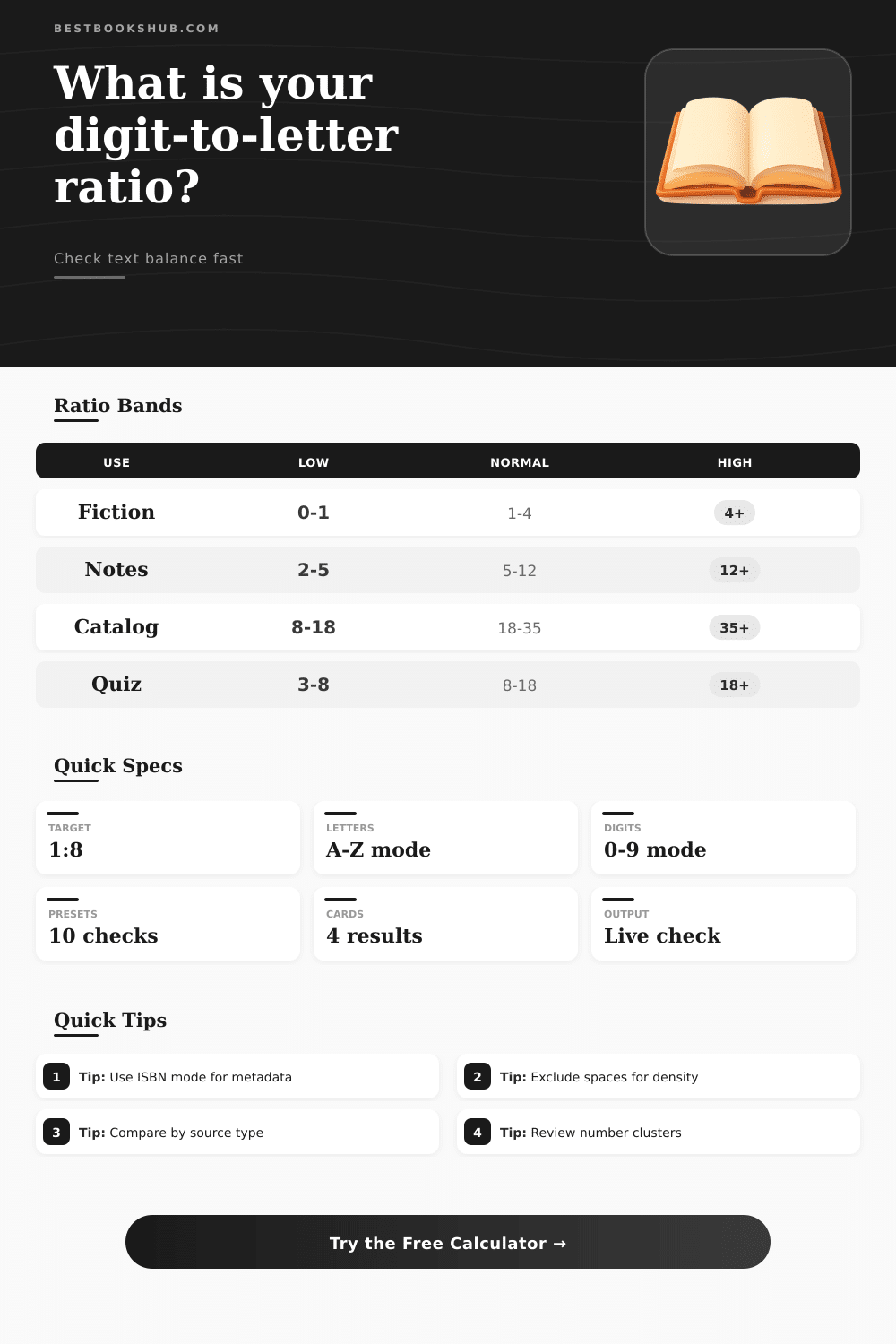
| Fiction or memoir prose | 0 to 4 | Chapter numbers, years, room numbers | High values may make prose feel record-heavy |
| Nonfiction with dates | 4 to 12 | Years, measurements, page references | Check if tables or notes are included in the sample |
| Academic page with footnotes | 8 to 20 | Citations, note numbers, dates | Dense notes can inflate the ratio quickly |
| Catalog or inventory text | 18 to 35 | ISBNs, accession IDs, shelf marks | Very low values can mean missing identifiers |
| Study guide or quiz page | 8 to 18 | Question numbers, page cues, answer keys | Check for inconsistent numbering styles |
| Counting Mode | What It Counts | Best For | Example Effect |
|---|---|---|---|
| Every digit character | Each 0 through 9 character | Layout density, visual clutter checks | ISBN 978 counts as 3 |
| Number groups count once | Each continuous numeric run | Editorial burden and reference frequency | Chapter 12 counts as 1 group |
| ISBN digits, X accepted | Digits plus terminal ISBN X markers | Book metadata blocks and catalog records | 0-19-X includes X as numeric signal |
| Ignore likely years | Skips 1500 through 2099 groups | History prose with many date references | 1894 is removed from digit count |
| Preset Scenario | Typical Ratio Shape | Why It Matters | Useful Control Pair |
|---|---|---|---|
| Chapter With Dates | Low to moderate | Separates natural prose from date-heavy passages | Nonfiction plus ignore years |
| ISBN Data Block | Very high | Confirms identifiers dominate metadata snippets | Metadata plus ISBN mode |
| Poem With Line Numbers | Moderate | Shows line markers without overcounting words | Exclude spaces plus number groups |
| Back Matter Index | High | Page locators can overwhelm letter content | Index plus split code segments |
| Comparison Check | Lower Ratio Meaning | Higher Ratio Meaning | Best Next Review |
|---|---|---|---|
| Manuscript page | Mostly narrative language | Many dates, addresses, or room labels | Read the numeric clusters aloud |
| Bibliography entry | Author/title dominant | Year, volume, issue, and pages dominant | Verify citation style consistency |
| Library export row | Possibly missing IDs | Identifier-rich record | Compare ISBN and accession fields |
| Study packet | Long prompts | Heavy numbering or answer keys | Check student-facing readability |
💡Calculation Tips
DISCLOSURE: This post may contain affiliate links, meaning when you click the links and make a purchase, I receive a commission. As an Amazon Associate I earn from qualifying purchases.
If you’re looking at a manuscript and thinking ‘Gah!’ at all of the numbers, then you might be experiencing the quiet panic that accompanies too many numbers on a page. Whether it’s a technical manual which resembles a spreadsheet, or a historical novel where there’s a date included in each paragraph, our brains don’t read digits as part of the narrative; we just see them as data points. That visual fatigue isn’t made up. But how do you measure it by eye? How can you tell what matters from what doesn’t in your text density?
Instead of leaving you to guess at the conversions and coefficients, the calculator (above) does all the math for you, after you input your sample. Here’s how: It compares the volume of alphabetic letters to the volume of numerical characters. Why? Because this ratio tells you about the texture of your content. The chapter of a fiction book should feel light on numbers; its prose should be able to carry the load. On the other hand, the catalog entry for a library book are supposed to be heavy with identifiers. If your novel weighs in at the same density of digits as an inventory list, then something is off. And the tool help you spot this imbalance before it becomes a problem for the reader.
How to Use This Number Calculator
Most people gets hung up on the setting of the controls. Out of the box it will work OK for a quick check, but what makes it valuable is adjusting the rules to fit your context. So if you’re reviewing historical nonfiction, maybe the problem isn’t so much the years per se. Dates interrupt the flow of narrative, they create clutter. Changing the digit counting rule to exclude likely years removes interruptions by stripping off the four-digit numbers and leaving only the truly disruptive ones. That’s important because a random room number interrupts your concentration; a year helps you set the scene.
But it also makes a difference how you’re defining “text”. For example, whitespace tends to increase our perception of how long something is compared to its cognitive burden. If we take out the spaces then we get a more precise metric of how much information are packed into a space; good for checking layouts. You might find that a page looks sparse because of wide margins, but the text itself is actualy quite dense with alphanumeric characters. This tool allows switching between these perspectives quickly to help you determine if the problem is content or formatting.
For example, think about how grouping numbers as a unit may compare with counting each individual digit character. An ISBN or a phone number are one piece of data, it’s just a long string of characters, but one. It takes up space on the page but it counts as only one thing in terms of what the reader reads. Counting them all separately skews the ratio upwards, suggesting more visual clutter then there really is in the reading experience itself. Grouped, it provides a closer approximation of editorial burden. Do you want to know how often numerical interruptions happen, or do you care about the visual weight they make on the page?
It’s certainly nothing limited to book editors. Knowing these ratios would benefit anyone working with structured data. Teachers check whether their study guide overwhelm or are understandable. Librarians check if their metadata blocks is consistent. And so forth. There’s a table of expected bands (on the same page) that spells this out based off type of content. If your number isn’t within those bands, that’s a flag to take a second look at.
It is not necessarily a reason to tear up what you’ve written and start again, but it is a red flag that you might of wanted to know why those numbers came out like that. In short: Numbers make for precise text. They break up the narrative flow. Neither effect are necessarily bad. But they should serve a purpose proportional to their presence.
So let’s take our text, paste it into this thing and ask ourselves if we have the number-to-text ratio we intended to have. If something doesn’t feel right, believe that impulse and dive into the settings to see what’s going on down there. This is a tiny bit of detective work, yes, but it shows you the shape of what you’re working with in a way that reading over never can. Understanding the balance allows you to control the beat, keeping the numbers where they belong and the words where they matter most.