📏 Reading layout measure
Reading column width calculator
Estimate readable text column width, characters per line, em measure, line count, and comfort score for book pages, essays, ebooks, PDFs, and responsive articles.
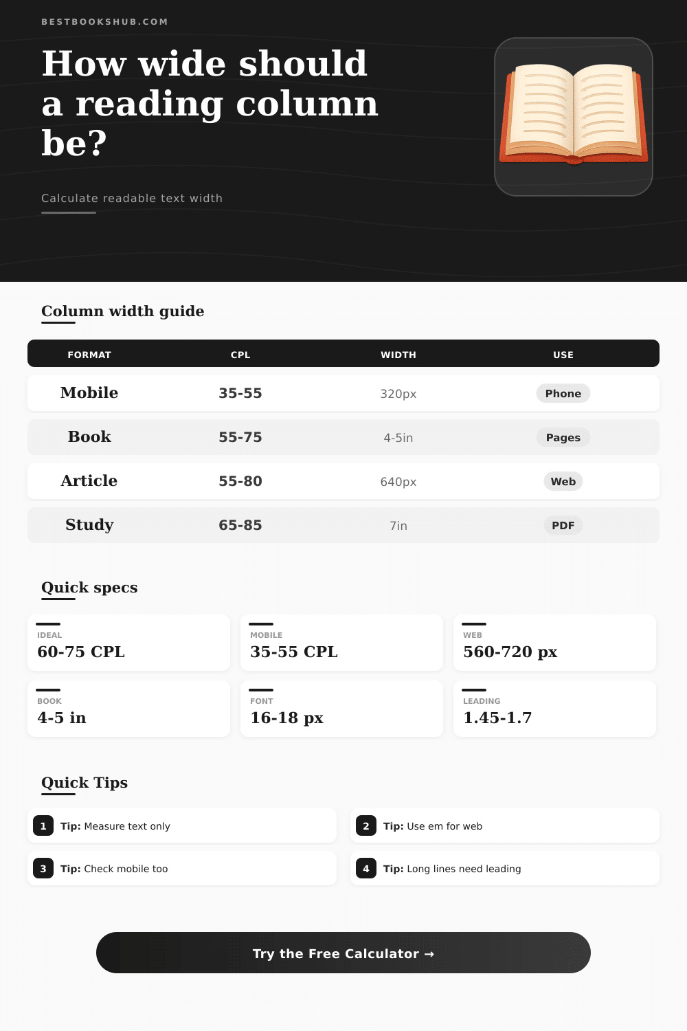
| Reading format | Comfortable CPL | Common width | Layout use |
|---|---|---|---|
| Paperback page | 55-70 CPL | 4.0-4.8 in | Fiction, memoir, and narrative nonfiction. |
| Hardcover page | 60-75 CPL | 4.6-5.4 in | Long-form prose on larger pages. |
| Web article | 55-80 CPL | 560-720 px | Responsive essays, guides, and reviews. |
| Ebook reader | 45-70 CPL | Device dependent | User-adjustable font size and margins. |
| Mobile reading | 35-55 CPL | 320-420 px | Phone screens and narrow reading panes. |
| Academic PDF | 65-85 CPL | 6.5-7.5 in | Study pages, abstracts, citations, and notes. |
| Font size | 60 CPL width | 66 CPL width | 75 CPL width |
|---|---|---|---|
| 14 px text, 0.52em average character | 437 px | 480 px | 546 px |
| 16 px text, 0.52em average character | 499 px | 549 px | 624 px |
| 18 px text, 0.52em average character | 562 px | 618 px | 702 px |
| 20 px text, 0.52em average character | 624 px | 686 px | 780 px |
| Measured CPL | Reader effect | Likely adjustment | Column note |
|---|---|---|---|
| Under 35 CPL | Very frequent returns | Widen the text column | Often choppy for continuous prose. |
| 35-54 CPL | Compact and fast | Good for mobile or notes | Can feel narrow on desktop pages. |
| 55-75 CPL | Balanced tracking | Usually keep this width | Strong default for books and articles. |
| 76-90 CPL | Longer eye travel | Add leading or narrow width | Works better for study pages than novels. |
| Over 90 CPL | Easy to lose the next line | Narrow width or split columns | Consider larger type or a max-width. |
| Layout choice | Width rule | Gutter rule | Best check |
|---|---|---|---|
| Single article column | Set max-width in em | No gutter needed | Desktop and mobile both stay readable. |
| Two-column study page | Calculate each column | Use at least 18-24 px | Columns do not crowd citations or notes. |
| Print book proof | Measure live text block | Ignore page margin | Several full prose lines sit near target CPL. |
| Ebook template | Test small and large font | User margin changes | Target remains comfortable across settings. |
| Annotation layout | Protect body column first | Separate note rail clearly | Main text does not become too narrow. |
DISCLOSURE: This post may contain affiliate links, meaning when you click the links and make a purchase, I receive a commission. As an Amazon Associate I earn from qualifying purchases.
Line length is bad. You know you have this problem when you can’t control it on screen. Your eyes wander almost twenty inches until you arrive at the start of the following sentence when you are reading through a long article that takes up your entire laptop screen. The piece isn’t poorly written, the page’s layout is poorly designed.
The width of columns is an unseen aspect of design. It determines how much effort reading take. Too wide and the brain has to work harder to reorient itself after every carriage return. Too wide, and it require excessive brainpower to realign with every line break.
How to Make Your Text Easy to Read
There’s no artistry involved in choosing a column width; only ergonomics. The math gets run for you by the column calculator (above). It converts fuzzy visual goals into precise inch or pixel value appropriate to your constraints.
The rule of thumb that most designers is familiar with is 60 to 75 characters on a line. It’s a helpful rule… Assuming an average character width in a given font, but many fonts aren’t “average.” A wider sans-serif takes up more room horizontally different than does a condensed serif font. Monospace fonts like programming fonts also take up a lot of space. If you compare two different lines set at the same pixel width, you’ll end up with radically different numbers.
To make up for that, the tool allow you to account for average character width so you can close the gap between theory and what typography actualy looks like. Keep in mind medium as well. What’s physically possible with a printed paperback page isn’t necessarily what’s possible with your web browser. It doesn’t make sense to zoom into a book; you lose the contextual frame. The measure needs to feel good at a set distance away.
By contrast, screen reader users can choose both their viewport width and font size. Something that’s perfectly comfortabley at 16 pixels may be uncomfortably wide at 24 if someone zooms in for improved legibility. This is why responsive designs uses a lot more relative units (e.g., ems) instead of fixed pixels. See the reference table below for how optimal number of pixels changes based off whether you’re designing for desktop monitor vs mobile phone.
The second factor is the rhythm of text. Essays and fiction gets better with narrow columns, since they establish a rhythm. Dense academic writing get away with wide columns, since the readers will be looking out for keywords. These are weighted by the comfort score on the calculator. This lets you assess how well your layout promote the type of reading you’re aiming for… All in one number.
Lots of folks do that; they use the total width of the container as their measurement. They account for gutters, margins, sidebars… all of it. That will blow out the widths and your lines ends up being way too wide. Only measure what’s going to be live text area. The columns/padding adjustment removes that. It whittles down extra space to reveal true width of what people will be reading.
A good designer organizes information and makes it easy to process. With good typography, you make the words dissapears so you only see the meaning. A good typographic design is so seamless that you don’t even have to think about where your eye land next. You can tweak those variables and see what comes out in terms of your format and your font so you could of make sure your layout is about reading.”