📖 Layout balance lab
Image-to-text ratio calculator
Estimate how much page area is used by figures, illustrations, screenshots, captions, body copy, and white space in academic drafts, worksheets, and book layouts.
Load a realistic academic or publishing layout, then adjust the dimensions, image blocks, caption lines, and text settings for your own page or spread.
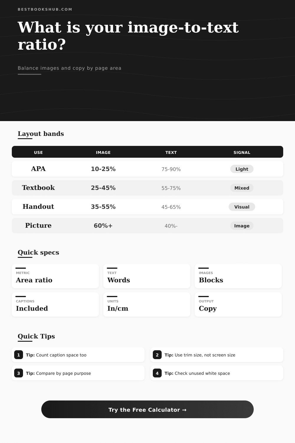
| Layout purpose | Image share | Text share | Typical ratio | Best use |
|---|---|---|---|---|
| APA manuscript page | 10% to 25% | 75% to 90% | 0.11:1 to 0.33:1 | Figure pages and evidence-heavy drafts |
| Journal article page | 15% to 35% | 65% to 85% | 0.18:1 to 0.54:1 | Research articles with charts or tables |
| Book or thesis chapter | 8% to 28% | 72% to 92% | 0.09:1 to 0.39:1 | Scholarly chapters with occasional figures |
| Textbook or workbook | 25% to 45% | 55% to 75% | 0.33:1 to 0.82:1 | Instructional layouts and worked examples |
| Picture book or visual essay | 60% to 85% | 15% to 40% | 1.50:1 to 5.67:1 | Image-led storytelling and illustrated spreads |
| Poster or infographic panel | 45% to 70% | 30% to 55% | 0.82:1 to 2.33:1 | Conference panels, one-page handouts, visuals |
| Page format | Trim size | Usable area at margins | Common image block | Layout note |
|---|---|---|---|---|
| US Letter manuscript | 8.5 x 11 in | 58.5 sq in at 1 in margins | 5 x 3 in chart | APA drafts often reserve wide text margins |
| A4 article draft | 21 x 29.7 cm | 456 sq cm at 2.5 cm margins | 12 x 8 cm figure | Comparable to a standard research draft page |
| Trade book page | 6 x 9 in | 35 sq in at 0.65 in margins | 4 x 2.5 in image | Useful for nonfiction chapter planning |
| Textbook spread | 16 x 10 in | 123 sq in at 0.8 in margins | 5 x 4 in diagram | Multi-image pages need caption space tracked |
| Poster panel | 24 x 36 in | 782 sq in at 1 in margins | 10 x 7 in figure | Large visuals should still leave reading paths |
| Text setting | Line height | Approx words per line | Text density | When to use |
|---|---|---|---|---|
| APA double-spaced | 2.0 | 8 to 11 | Low | Manuscripts, student papers, review drafts |
| Article single-spaced | 1.15 | 7 to 10 | Medium | Journal proofs and newsletter-style columns |
| Book interior | 1.25 | 8 to 12 | Medium | Trade books, nonfiction chapters, manuals |
| Textbook block | 1.3 | 6 to 9 | Medium | Instructional pages with callouts and diagrams |
| Poster caption | 1.1 | 5 to 8 | High | Short labels, figure notes, panel summaries |
DISCLOSURE: This post may contain affiliate links, meaning when you click the links and make a purchase, I receive a commission. As an Amazon Associate I earn from qualifying purchases.
Ever look at a draft and just feel as if something isn’t right? Your text doesn’t seem to fit; maybe images is floating aimlessly. It is rarely related to what you are saying.
It’s nearly always got everything to do with space. Creating a balance between copy and visuals are closer to physics than it is art. There’s only so much space on the page. Each inch you dedicate to a chart mean one less inch for your argument. Once you input your dimensions into the calculator above, it do the math for you, saving you from all of the guesswork around conversions and coefficients that typicaly come along with laying out the plan.
Why Space Matters in Design
Images is an after-thought for most folks: they write the paper, then cram pictures where Word won’t let them slide any more. That’s backward: professional layouts begins with ratio. Here are a few examples: If you’re working on an APA-style manuscript, there’s a strong conventional lean toward text; credibility in these fields is built through citation trail and amount of evidence. But if you’re creating a workshop handout or even a chapter in a textbook, big blocks of text can makes it harder to read rather then easier.
Here the secret is to match how much your reader has to think to the visual weight. It’s based off actual area. It doesn’t count images only (i.e., there is no difference between six thumbnail-sized images crammed into a corner of the screen and one larger full-page illustration). Why does that matter? Because six tiny thumbnails takes up less reading real estate than a single large full-page illustration.
The system trims out dead space by asking for your page dimensions and margin settings. The default margin for most manuscripts are one inch from all sides. It sounds like nothing. A thin border. But it makes your available canvas much smaller, leaving less room for what you want to appear on a page. If you don’t plan for margins, your printed layout will feel crowded.
Another type of white-space-killer are captions, which is text descriptions of an image that designers might assume aren’t part of the text area. But a two line caption in smaller font size still occupies some vertical space. And it moves the body copy down, or creates a page break. The calculator allow for caption lines and font sizes, since all these small details adds up to a large amount of space throughout a long document. If you’re writing lots of annotations on your images, factor that into the equation early on.
Now consider the rhythm of what you write. Do you want to use one long block of two hundred words and follow it with a chart? Or do you want to mix shorter paragraphs with smaller images? The former is easier to lay out but feels like less of an invitation; the latter takes more precise layout work, but feel more inviting. Perhaps you decide based on your target image share; and you see a nice balance there, only to discover when it comes time to type in the words, you’ve got a lot of them. Well then, the empty space around the pages can tell you whether you have space to breathe or must reduce some visuals or even cut down some copy.
White space isn’t empty. White space is functional, it sends a signal: this page is clear. A page with clutter suggest there is confusion. An open page suggests confidence. Before the reader has even begun to read, if your calculation indicates that there’s not much white space left on the page, then you have probably made your reader feel overwhelmed. Too much white space makes the content feel like it’s underdeveloped or sparse. Iteration is required to find the sweet spot. Use fewer images, tweak the line spacing, and adjust the font size until proportions feels naturaly.
Layout is an exercise in respect for the reader’s eye. It’s creating a visual hierarchy to guide them through the page. It’s breaking up figures so they helps with understanding, not just filling in empty spaces. Quantify these spaces. Go from guessing based off your feelings to planning based on facts. Stop wondering if this page looks too busy and know exactly how much each element will claim on the page. Transform a vague aesthetic concern into a manageable design variable. Get to a point where you have carefully thought about the whole page. Every inch should of serve the message instead of just being there.