📖 Layout spacing tool
Paragraph indent depth calculator
Convert first-line paragraph indents across inches, centimeters, points, picas, ems, characters, and typed spaces for manuscripts, essays, and print layouts.
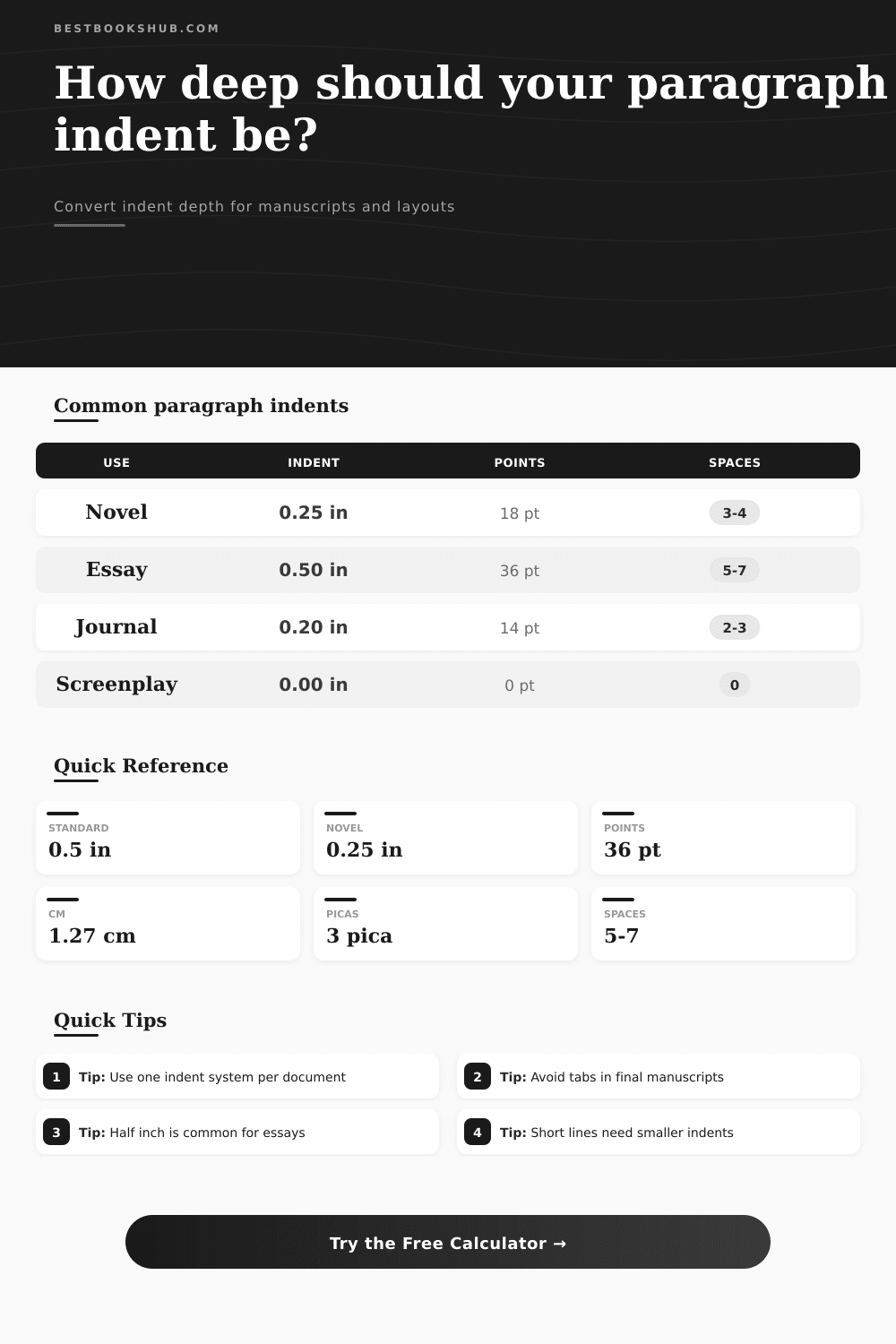
| Document type | Common indent | Point value | Layout note |
|---|---|---|---|
| Novel manuscript | 0.25-0.50 in | 18-36 pt | First line only; often no indent after breaks |
| Academic essay | 0.50 in | 36 pt | Frequent default for MLA, APA, and Chicago papers |
| Journal article | 0.15-0.25 in | 11-18 pt | Smaller indents suit narrow columns |
| Ebook layout | 1.0-1.5 em | Varies | Relative units scale better with reader settings |
| Screenplay | 0 in | 0 pt | Use script margins instead of paragraph indents |
| Indent depth | Centimeters | Picas | Approx. spaces |
|---|---|---|---|
| 0.125 in | 0.32 cm | 0.75 pc | 2-3 spaces |
| 0.20 in | 0.51 cm | 1.2 pc | 4 spaces |
| 0.25 in | 0.64 cm | 1.5 pc | 5 spaces |
| 0.33 in | 0.84 cm | 2.0 pc | 6-7 spaces |
| 0.50 in | 1.27 cm | 3.0 pc | 9-11 spaces |
| Line measure | Gentle indent | Standard indent | Maximum cue |
|---|---|---|---|
| 20-35 characters | 0.10 in | 0.15 in | 0.20 in |
| 36-55 characters | 0.15 in | 0.25 in | 0.33 in |
| 56-75 characters | 0.20 in | 0.33 in | 0.50 in |
| 76-95 characters | 0.25 in | 0.40 in | 0.50 in |
| 96+ characters | 0.33 in | 0.50 in | 0.60 in |
| Unit | Formula to inches | Best use | Accuracy note |
|---|---|---|---|
| Points | pt / 72 | Print layout | Exact typographic conversion |
| Picas | pc / 6 | Book design | 1 pica equals 12 points |
| Ems | em x font / 72 | Ebooks and CSS | Scales with selected font size |
| Spaces | spaces x em width | Rough draft matching | Depends heavily on font |
| Centimeters | cm / 2.54 | Metric manuscripts | Exact length conversion |
Indent style comparison
DISCLOSURE: This post may contain affiliate links, meaning when you click the links and make a purchase, I receive a commission. As an Amazon Associate I earn from qualifying purchases.
If you’ve ever fought with a word processor about your indents, you’re not alone. While word processors is trying to assist, they’ll shove a half-inch indent on anything from an email draft to a novel manuscript. A quarter-inch indent works differently on a page of a wide novel versus one narrow academic column. It makes all the difference between a feeling of cramp versus invitation.
This page’s calculator will do the math for you, and leave you free to think about visual rhythm instead.
Why Indentation Matters
But it’s all in the numbers: The problem here is scale. A line indent isn’t just a number. It’s a ratio of another line your going to read.
When the line is short (maybe twenty or thirty characters wide) and your indent is deep, then it devours too large a portion of horizontal space. Your paragraph appear hollowed-out at the left end. On a longer line, a slight indent vanishes. The reader must work harder to identify the moment when one thought ends and another start.
With this tool you can change the width of the line measure and observe how its indent responds as the line changes length. Observe the percent of the line the indent consumes. This is what matters more then the raw indentation value, whether inches or millimeters.
Generally speaking, a quarter-inch indent is preferred by novelists. Trade manuscripts require it. Trade books are traditionally the same. A quarter inch indent guide the eye without visually stuttering. Yet, many academic papers call for a half-inch indent. Why? It is partly tradition and partly because academic margins can be wider.
And so the reference table below breaks this stuff down… Showing you the difference between what’s expected of a screenplay versus a journal article.
Screenplays are an exception in this regard. Very few screenplays actualy use paragraph indents. Instead, they depend on margin rules (and block spacing) to distinguish action from dialogue. Indenting any old way in a script format create mayhem.
The other variable that digital layout throws at you is the use of relative units. Fixed inches aren’t as helpful when you’re designing for an ebook or screen. People set their own font size. Hardcoding a quarter inch indent would appear tiny if they switches to a larger font size for accessibility purposes.
The term is ems. An em is defined as equal to the size of the font in question. A one-em indent means the paragraph starts based off how wide the letter M is. It scales automatically. As the text increases, so does the indent.
The calculator will help you convert your desired fixed units into point values and em equivalents, translating your print preference into something more web-friendly.
Don’t indent with spaces. It is the number one amateur formatting error. On your monitor, hitting the space bar five times looks great. When the page reflows, when the font changes, when the document gets printed out, forget about it.
Professional typesetters don’t use spaces for indents; they use paragraph styles. They set the rule once and all their paragraphs obey it. It ensures consistency across hundreds of pages. They make editing quicker. Later, if you realize that a half-inch is too aggressive, you don’t have to go through each individual paragraph and change them by hand, just edit the style setting. This appears instantly in the tool’s live preview.
You may select either a block paragraph (no indent), a hanging indent (good for reference lists and citations), or a first-line indent. Because they have no indent, block paragraphs use white space between them to indicate a new thought. This is popular in business memos and web articles. It’s airy and moddern, but it wastes valuable vertical space on the page of a print book.
Then consider how dense the text is. Long paragraphs with lots of words demand a stronger visual cue to break up the wall of words. Text with a lot of dialogue doesn’t require as much. This is why the text density setting is part of the calculator. It allows you to dial that in and it will give you a suggestion based on your settings. You don’t need to guess. You can see what it looks like before committing.
The indent isn’t about obeying the rules; it’s about leading the reader’s eyes. It is a little signal that says, “Hey! It is a little signal that says, “Hey! Reset!” And when you get that signal right, reading pages is easier. When you get it wrong? Text gets disjointed.
So use the tool. Find the balance that works for you and your specific document. If in doubt, start with the presets. They’ll cover the most common cases. Then adjust the numbers until it looks right in the preview. Trust your eye. Let math help.
The indent is a small thing, but it matters. It sets the pace for what comes next.