📐 Layout measurement tool
Characters per line calculator
Measure average line length, longest lines, CPL fit, and recommended text width for drafts, book pages, notes, and web reading layouts.
| CPL band | Typical use | Reader effect | Layout note |
|---|---|---|---|
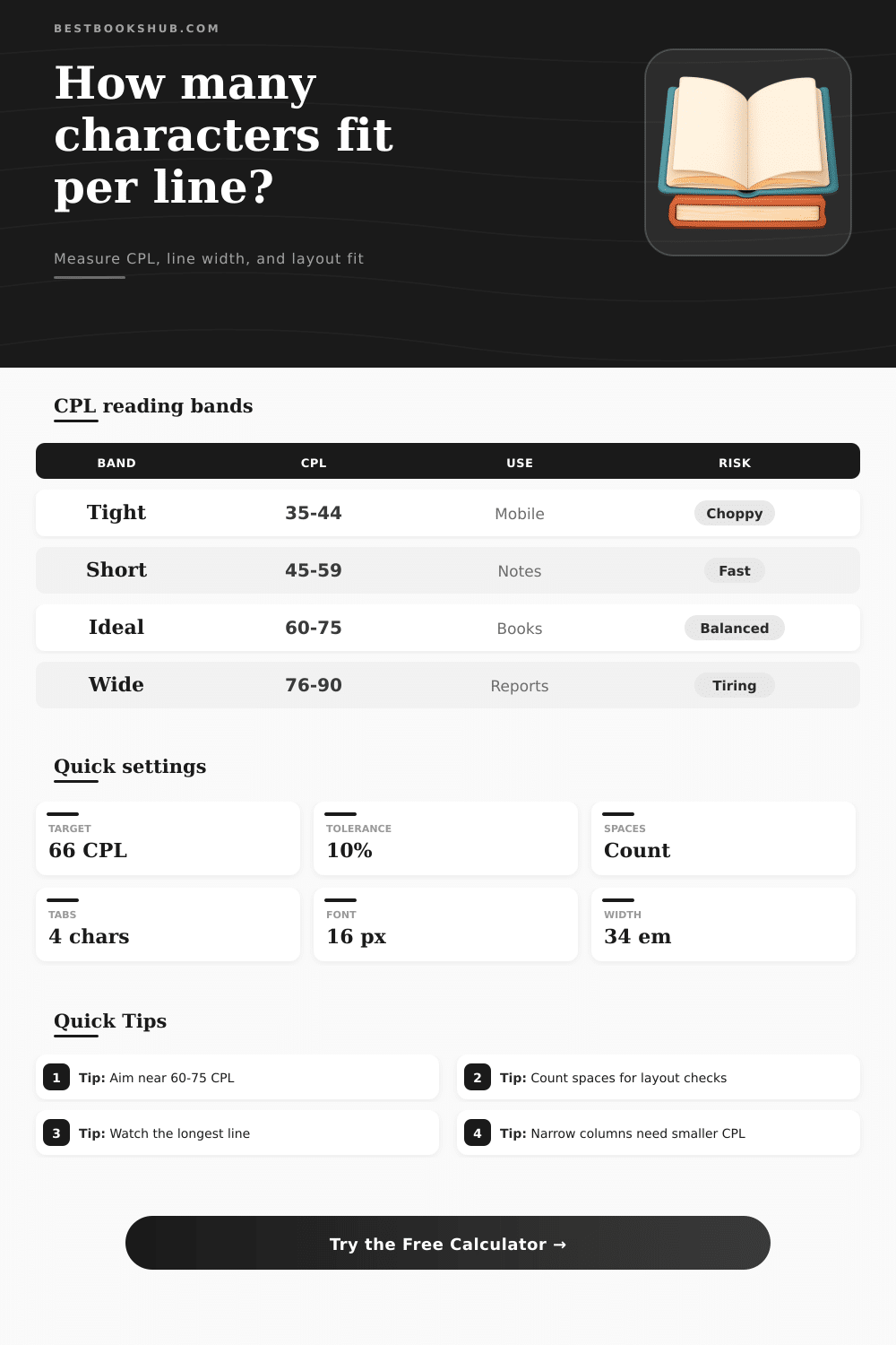
| 35-44 | Mobile sidebars, captions, poetry | Fast return sweeps, more broken phrases | Best for compact content, not dense chapters. |
| 45-59 | Study notes, narrow columns, newsletters | Easy scanning with moderate line breaks | Works when paragraphs stay short. |
| 60-75 | Book pages, essays, long articles | Balanced rhythm for continuous reading | Strong default for body copy and drafts. |
| 76-90 | Reports, wide tablets, reference pages | Fewer breaks, more eye travel | Use larger leading and clear paragraph spacing. |
| 91+ | Wide desktop blocks and pasted documents | Can feel tiring across long paragraphs | Narrow the text block or raise font size. |
| Format | Common CPL | Font basis | Good check |
|---|---|---|---|
| Trade paperback | 55-70 | 10-12 pt serif | Measure several full prose lines. |
| Hardcover novel | 60-75 | 11-12 pt serif | Watch long paragraphs and dialogue. |
| Academic article | 70-90 | 10-12 pt serif or sans | Use columns when the page is wide. |
| Ebook reader | 45-75 | User selected | Check small, medium, and large text. |
| Web article | 55-80 | 16-20 px sans | Estimate in em and test mobile width. |
| Font setting | Average char width | 66 CPL width | Use when |
|---|---|---|---|
| Narrow serif | 0.48 em | 31.7 em | Traditional book fonts and compact print. |
| Book serif | 0.50 em | 33.0 em | General manuscript and proof layouts. |
| Readable sans | 0.52 em | 34.3 em | Web body copy and editorial tools. |
| Large sans | 0.55 em | 36.3 em | UI text with generous letter shapes. |
| Monospace | 0.60 em | 39.6 em | Code notes, plain text, terminal exports. |
| Workflow | Measure first | Adjust next | Final check |
|---|---|---|---|
| Book proof | Full prose page | Trim width or type size | Average lines near target range. |
| Website article | Desktop and mobile columns | Set max-width in em | Long paragraphs remain readable. |
| Newsletter | Main content column | Raise width for dense summaries | No headline lines dominate the average. |
| Poetry or verse | Original line breaks | Avoid forced wrapping | Longest lines fit without awkward breaks. |
| Manuscript edit | Representative chapter page | Normalize tabs and spaces | Outlier lines are intentional. |
DISCLOSURE: This post may contain affiliate links, meaning when you click the links and make a purchase, I receive a commission. As an Amazon Associate I earn from qualifying purchases.
When we read on wide screens, our eyes gets strained. Why? We try to follow a line of text but then we can’t find where it went. We have to move our heads slightly to go back to the beginning. It’s a loss in flow that costs us understanding. Before we know it, we’ve broken the rhythm of reading.
It’s not usually the words themselves that are the issue; it’s the width of the space that contains them. There’s an invisible metric called “characters per line,” or CPL. Does your text glide comfortabley across the screen, or do you keep stumbling over awkward returns? The best length is between 60 and 75 characters; a rule known to most designers.
Why Line Length Matters for Reading
But try applying this rule in real life and you’ll notice there’s a problem: a character have no fixed width. Even when shown at the same pixel size, an italic serif font will require more horizontal space different than a sans-serif condensed font. And fluid prose require far less width then a monospace code block containing the same content. Guessing the width of your container without taking into account your chosen typeface is like shooting in the dark. By choosing the font metrics, the calculator above do the calculation for you. You don’t have to estimate the average character width manually anymore.
Which approach should you take for counting? There are some who count only digits and letters they can see. Why? Because spaces look like nothing so why bother with them? The truth is that in a layout context, space is not nothing. Space takes up pixels just as much as an ‘i’ or an ‘M.’ If you don’t count spaces, you get a distorted impression of how many characters fits per line.
The tool’s count including spaces reflects the visual impact of the paragraph and this difference becomes important if you copy straight from a manuscript into a web editing program. Indentation and tabs may be pretty in a word processor, but they blow out into huge gaps when rendered in a browser. Get your tabs right so number counts align with what will be displayed on-screen.
Comfort depends on context. Tight, jagged lines makes poetry sing with their demand for short pauses and heightened attention. Wider lines work better in a dense academic report: they minimize the need to turn pages/scroll down. However, each individual line may be just a little too long for casual reading.
The table on the page groups readability bands according to typical use case. It helps you place your project on the spectrum. Are you designing a mobile sidebar? Seventy characters is wrong goal. You’ll end up with frustrating, choppier fragments. Why not aim for a narrower target instead, say forty-five characters? That may feel restrictive initially. But it results in a much smoother scroll experience on small screens.
But what about outliers? On paper, an average of sixty-six looks great. That’s fine until you consider that thirty percent of your lines are long… And the other seventy percent aren’t. The long ones break up the rhythm set by the others. They force the reader to move their eyes further across the page. They create visual bottlenecks.
If the average isn’t close to the length of the longest line, there’s something wrong with your text block. This will cause readers stress over time. It’s a little thing, sure. But it counts when you’re asking people to read for a while.
A well-designed book will direct your eyes without making you work for it. The reader should not notice they is following lines. They should only notice the ideas. This is achieved by adjusting the width until it becomes invisible. Until their eye stops resisting the format. The text fades away until all that’s left is the meaning. That effortless reading experience makes an actualy page out of a list of words.