📱 Desktop to Mobile Font Size Converter
Scale your typography from desktop to mobile screens with accurate ratio-based conversions
| Element | Desktop (px) | Mobile (px) | Desktop (rem) | Mobile (rem) |
|---|---|---|---|---|
| Body Text | 16–18 | 15–16 | 1–1.125 | 0.938–1 |
| Lead Paragraph | 18–22 | 16–18 | 1.125–1.375 | 1–1.125 |
| H3 | 20–26 | 18–22 | 1.25–1.625 | 1.125–1.375 |
| H2 | 28–36 | 22–28 | 1.75–2.25 | 1.375–1.75 |
| H1 | 40–64 | 28–40 | 2.5–4 | 1.75–2.5 |
| Caption | 12–14 | 11–13 | 0.75–0.875 | 0.688–0.813 |
| UI Label | 12–15 | 12–14 | 0.75–0.938 | 0.75–0.875 |
| Navigation | 14–18 | 14–16 | 0.875–1.125 | 0.875–1 |
| Desktop Size | 320px Mobile | 375px Mobile | 390px Mobile | 428px Mobile |
|---|---|---|---|---|
| 12px | 10px | 10px | 10px | 11px |
| 14px | 11px | 12px | 12px | 12px |
| 16px | 13px | 14px | 14px | 14px |
| 18px | 14px | 15px | 15px | 16px |
| 24px | 18px | 20px | 20px | 21px |
| 32px | 22px | 25px | 26px | 28px |
| 48px | 30px | 35px | 36px | 38px |
| 64px | 38px | 44px | 46px | 50px |
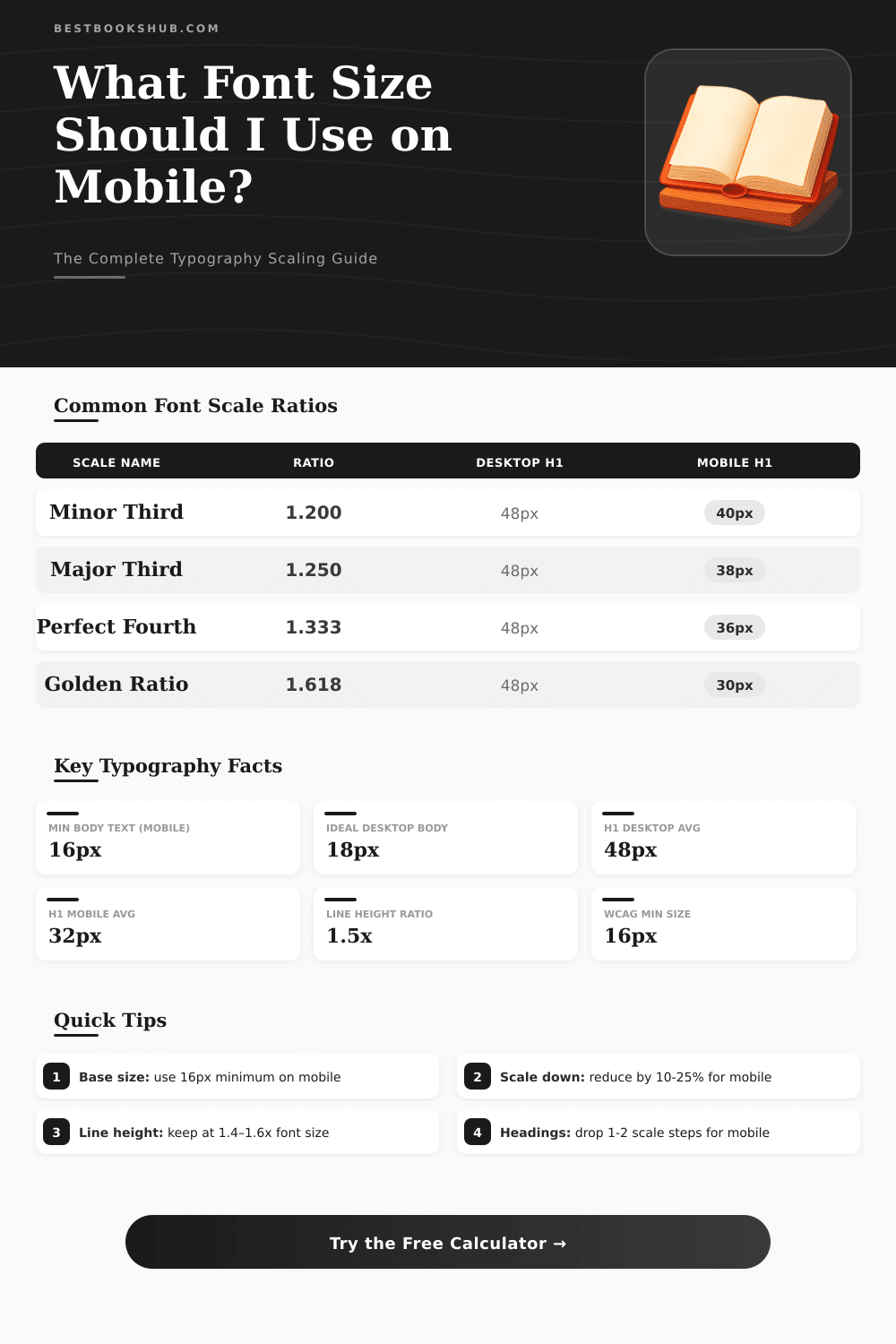
| Font Size (px) | Line Height 1.4 | Line Height 1.5 | Line Height 1.6 | Rec. Use |
|---|---|---|---|---|
| 12px | 16.8px | 18px | 19.2px | Captions |
| 14px | 19.6px | 21px | 22.4px | UI Labels |
| 16px | 22.4px | 24px | 25.6px | Body Text |
| 18px | 25.2px | 27px | 28.8px | Lead / Intro |
| 24px | 33.6px | 36px | 38.4px | H3 |
| 32px | 44.8px | 48px | 51.2px | H2 |
| 48px | 67.2px | 72px | 76.8px | H1 |
Bulk converter for types is a resource that converts usual measures from one type to another. It helps to change between pixels, spots, rem, trends, percentages and other sizes as strings, millimeters or inches. Usually it includes a calculator and table, what simplifies the course of pt to px, of px to pt and other changes.
DISCLOSURE: This post may contain affiliate links, meaning when you click the links and make a purchase, I receive a commission. As an Amazon Associate I earn from qualifying purchases.
Such resources are widely used and operate directly in the browser.
How to Convert Font Sizes
Switching between different measures of Font Size commonly is a hard cause. One must know at least five main kinds of units and understand, as they relate, what is natural for digital platforms. For instance, 10 spots match to 13 pixels.
Because those numbers do not match, usage of converter escapes many efforts for guess.
Use tools for convert Font Size care about sameness through various devices and browsers. It is especially helpful in matching Desktop Mobile design. Tools of that type back changes between px, em, rem, vw and percentages.
Platforms as Elementor and other drafts benefit from fast conversions of that kind.
For use converter of sizes, simply enter the Font Size, choose the starting unit and point the target. You can type any value for tip-unit, and it immediately converts to others. Some of them allow setting typical physical size as 16 px, 18 px or 20 px for the start.
Later the calculator adapts everything to rem or another wanted unit, what helps too preserve the sizes uniform through the whole website.
Size in spots follows precise mode for be measured. One measures it from the height of the highest riser until the base of the little x, and also from the most bottom descender until the top of that x. Sources as Arial, Optima New Novel and Calibri obey those rules quite well. Because of that they answer most for precise conversions from spots to inches.
By default the Font Size in websites is 16 px. If you set the root to 62.5 %, that results in 10 px, so 1 rem matches to 10 px. Like this rem-units become very simple to use.
Therefore, setting the body to 1.6 rem, you restore the plain text to its standard 16 px. Cascade-height in inches one can estimate by means of formula, that uses cascade-high units, unitsPerEm and spots shared by means of 72. The visible size however adjusts according to the font and the creative surroundings.
If Font Size in CSS is set by means of px as unit, the user cannot resize the type. This can create troubles regarding access flags, for instance WCAG. There is no unique right or wrong approach for Font Size in website.
It depends on the site kind and thewanted design flexibility. Although the text stays readable, the sizes then operate well.