🔤 Font Size Converter
Convert between px, em, rem, pt, vw, % — instantly and accurately
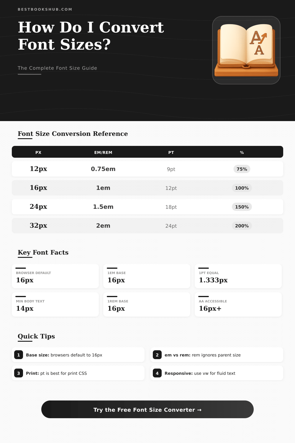
| px | em / rem (base 16px) | pt | % (base 16px) |
|---|---|---|---|
| 10px | 0.625em | 7.5pt | 62.5% |
| 12px | 0.75em | 9pt | 75% |
| 13px | 0.8125em | 9.75pt | 81.25% |
| 14px | 0.875em | 10.5pt | 87.5% |
| 16px | 1em | 12pt | 100% |
| 18px | 1.125em | 13.5pt | 112.5% |
| 20px | 1.25em | 15pt | 125% |
| 24px | 1.5em | 18pt | 150% |
| 28px | 1.75em | 21pt | 175% |
| 32px | 2em | 24pt | 200% |
| 36px | 2.25em | 27pt | 225% |
| 40px | 2.5em | 30pt | 250% |
| 48px | 3em | 36pt | 300% |
| 64px | 4em | 48pt | 400% |
| 72px | 4.5em | 54pt | 450% |
| vw | 375px (mobile) | 768px (tablet) | 1440px (desktop) |
|---|---|---|---|
| 1vw | 3.75px | 7.68px | 14.4px |
| 1.5vw | 5.63px | 11.52px | 21.6px |
| 2vw | 7.5px | 15.36px | 28.8px |
| 2.5vw | 9.38px | 19.2px | 36px |
| 3vw | 11.25px | 23.04px | 43.2px |
| 4vw | 15px | 30.72px | 57.6px |
| 5vw | 18.75px | 38.4px | 72px |
| Element | Web (px) | Print (pt) | Mobile (sp/px) |
|---|---|---|---|
| Body Text | 14–18px | 10–12pt | 14–16sp |
| H1 Heading | 28–36px | 22–28pt | 24–32sp |
| H2 Heading | 22–28px | 18–22pt | 20–24sp |
| H3 Heading | 18–22px | 14–18pt | 18–20sp |
| Caption / Label | 11–13px | 8–10pt | 11–13sp |
| Navigation | 13–16px | 10–12pt | 14–16sp |
| Button Text | 14–16px | 10–12pt | 14–16sp |
| Footnote | 10–12px | 7–9pt | 10–12sp |
em is relative to the parent element’s font size, while rem is always relative to the root (html) element. Use rem for predictable scaling.clamp(14px, 2vw, 24px) for responsive type that scales with viewport but stays within readable bounds. Combine with calc() for fine control.The size of the font decides where the text shows big or small on the screen and on pages. In CSS, the property font-size works to set the size of the font. When one changes the size of the font that also updates the values of units that depend on it, for instance em and ex.
DISCLOSURE: This post may contain affiliate links, meaning when you click the links and make a purchase, I receive a commission. As an Amazon Associate I earn from qualifying purchases.
One em equals the current size of the font in the element itself, so it works as a relative unit that adjusts according to basic changes.
What is font size and how to change it
The design for screens differs from that for printing. None ensures the size of fonts, except the basic truth that bigger Font Size always will seem more clear than smaller. Even the size of font does not stay fixed, because different types give different looks according to the style of the font.
Some types need a bit smaller or bigger size to reach equal results on the whole page.
For usual monitors of computers, one advises 12pt for the main text, which equals 16px. The default fonts should not go below 9pt or 12px. Print does not have strict rules, only custom.
In easy texts, size between 10 and 12 points one most likes. Novels use pages smaler than office paper, so commonly they choose a bit smaller font.
The CSS property font-size-adjust allows to change the size of lowercase letters regarding capitalized. It helps especially if backup fonts load. One can limit the size of font to a range, said between 24px and 26px, where the average value acts as ideal adjustment factor.
Like this the browser itself counts the size of fonts in that limited space.
In Windows, one changes the size of text by going too Configurations, later Access, later Size of text and movement of the slider. In iPhone, one goes to Configurations, later Access, later Screen and Size of text, and then strike bigger text to have more options for fonts. Except that, in iPhone one can add control of Font Size to the Centre of Control and use it only for certain apps.
Zoom through the browser also is useful. One clicks the three dots in the right end of the address bar, choose Zoom and choose the wanted percentage. Use the keys Ctrl + plus or minus to zoom in either way on any website in any browser.
Changes of Font Size in the configurations of the phone can apply directly to apps.
Because reading long texts like articles, a bit bigger Font Size together with tall lines commonly feels better. Clear order is important. Titles for posts, descriptions and greetings can use different size and weight of font according to their importance.
For summaries, minimum of 10pt one advises as good start. The cost of books printed according to demand depends on number of pages, and that number depends much on the font and its sizeused. Georgia forms a font friendly to web with nice proportions, during Hire works wide and stays readable in small size.