📐 Book layout spacing
Leading ratio calculator
Calculate line-height ratio, extra leading, half-leading, and text density for print pages, essays, ebooks, and web reading layouts.
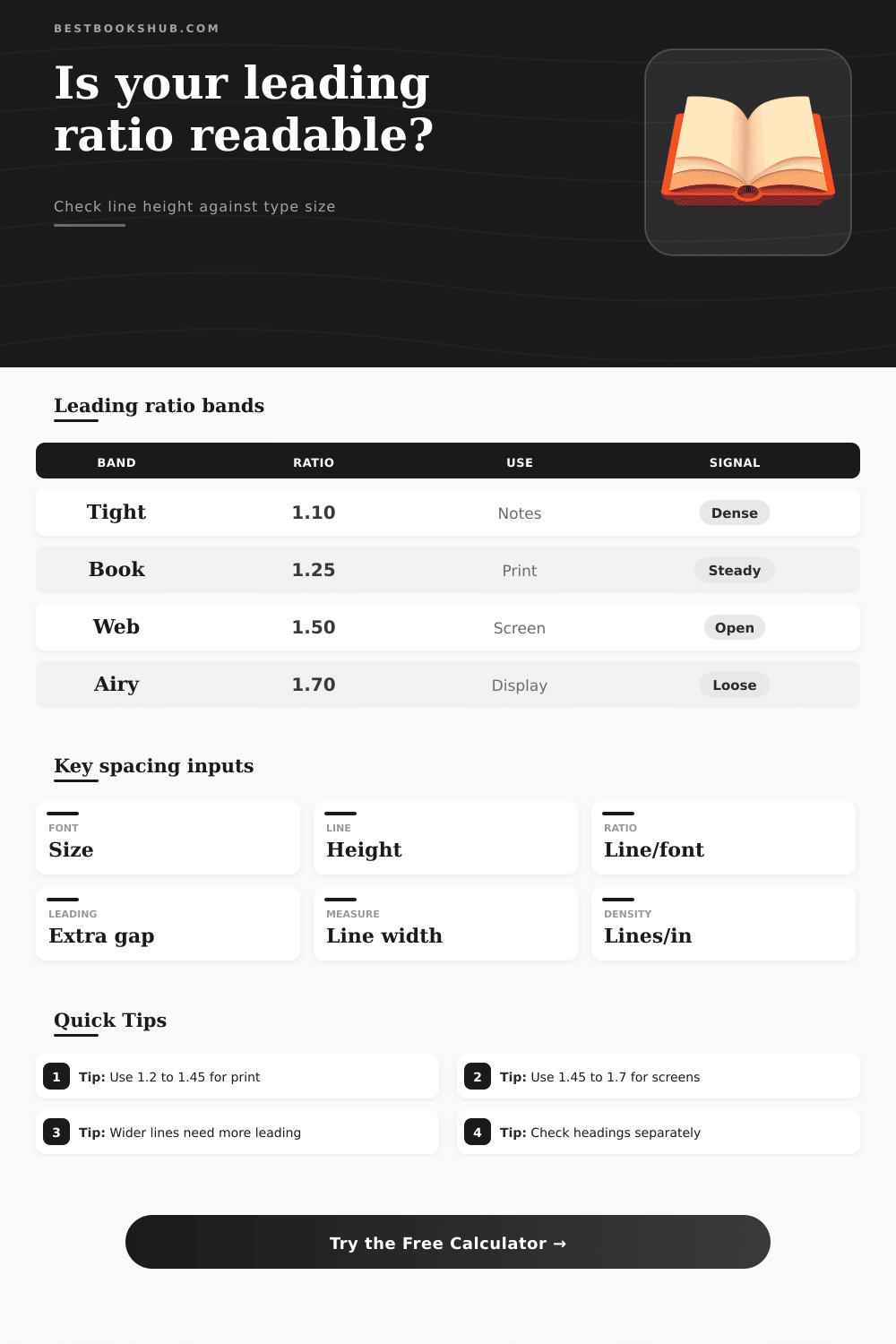
| Leading ratio | Spacing feel | Common use | Review cue |
|---|---|---|---|
| Under 1.10 | Very tight | Labels only | Check collisions |
| 1.10-1.24 | Tight | Notes, captions | Watch fatigue |
| 1.25-1.44 | Book balanced | Print body | Good default |
| 1.45-1.70 | Open | Web, ebook | Check page count |
| Over 1.70 | Airy | Display, poetry | May fragment text |
| Type size | Line height | Ratio | Typical placement |
|---|---|---|---|
| 8 pt | 9.5 pt | 1.19 | Footnotes |
| 10 pt | 12 pt | 1.20 | Compact paperback |
| 10.5 pt | 13.5 pt | 1.29 | Trade book |
| 12 pt | 18 pt | 1.50 | Web article |
| 16 pt | 24 pt | 1.50 | Large print |
| Measure width | Line length | Leading adjustment | Reason |
|---|---|---|---|
| Under 45 chars | Short | Can be tighter | Easy line return |
| 45-75 chars | Comfortable | Normal band | Standard reading |
| 76-90 chars | Long | Add 0.05-0.10 | Helps tracking |
| Over 90 chars | Very long | Add 0.10+ | Harder line return |
| Layout type | Target ratio | Density goal | Notes |
|---|---|---|---|
| Novel page | 1.22-1.40 | Moderate | Balance page count |
| Essay draft | 1.50-2.00 | Open | Room for markup |
| Ebook body | 1.35-1.65 | Flexible | Device dependent |
| Poetry | 1.30-1.80 | Variable | Line breaks matter |
DISCLOSURE: This post may contain affiliate links, meaning when you click the links and make a purchase, I receive a commission. As an Amazon Associate I earn from qualifying purchases.
The next time you grab a book off a shelf and read only a single page before setting it back down, ask yourself: What made you stop? Was it interesting? Probably. But the way it was laid out were working against you. There was too much blank space between lines, forcing your eyes to jump back to the beginning of every sentence. Or maybe they were too close together and your eyes kept sliding to next row without completing the previous one.
This is the kind of friction you can’t see. But which leads. This isn’t about prettiness; this is about directing the eye, right where it needs to go in order to make the act of reading feel effortless instead of labored.
Why Spacing Makes Reading Easier
Here’s how it works: I created a calculator on this page that does all the math for you in making these choices. All you do is type in font size (in points) and the line height (also in points), and it give you the ratio. That’s the key number for how easy it is to read. If the ratio is 1.20, then the line height is 20% larger than the size of text itself.
That’s pretty small and very effective for book pages because paper costs money, so fewer page make the book cheaper. However, when you take that same snug spacing onto a device or a website, you’ll probably be losing readers. Screens need some breathing room. Glare produced by backlit devices wash out contrast, and your eyes needs a little more space between lines vertically so they can find next line without straining. Think 50 or bigger.
“People mess this up all the time. They just increase font size. Making it two points bigger ought to do it, right? But nope; if you don’t change the leading too, it doesn’t realy work.” What’s comfortable isn’t the font size alone; it’s the balance of the letter height versus the surrounding whitespace.
If you have an overly wide column of text, over, say, seventy-five characters per line… Then your eye has to travel a long way horizontally. It has to compensate in vertical direction for all that horizontal effort. For a narrower column, where the return trip is shorter and easier, you get away with tighter spacing.”
If this is new ground for you, you may wonder how to begin. Between 1.20 and 1.45 are a useful guide for typical body text in print. Most adult readers who is used to books published the old-fashioned way find this comfortable. If you’re working on an essay or draft with room to write comments by hand, you’ll likely prefer a little more space (say, 1.50) or even double-space (2.00).
Then there’s footnotes. These support the main argument and therefore can be more dense. Often, footnotes is somewhere between 1.10 and 1.25. Think of it as creating hierarchy. Secondary information should of be compact but not unreadable; the primary text should feel open and inviting.
You can try it out yourself here. The following screenshot shows one of my current projects in progress. You can enter your font size and line height and it’ll tell you instantly what the resulting density looks like as well as the lines-per-inch, which helps you estimate how much text fits on a page. This can be helpful if you’re an editor who needs to juggle word count with physical space.
Do this and see if your layout is too tight; doesn’t mean you need to bump up the fonts. In fact, sometimes increasing your leading by ½ a point can make a huge difference. It creates some breathing room that won’t inflate the overall page count all that much but will prevent eye fatigue.
In the end, though, it’s invisible: Good typography goes unnoticed by readers. They read it without thinking about spacing; they just soak up the words. Bad spacing produces a low-grade irritation that sucks away attention little by little. If you check the ratios beforehand (before locking down your layout), you eliminate that friction. You make it easy for the reader to follow along from sentence to sentence.
This may be a small aspect of design, but it has disproportionate impact on the reading experience. Use the standard ranges as a starting point, then tweak them according to your medium of choice, then let the math guide you into the comfort zone. Your eyes are sharper then you think, and they reward care with endurance.