📐 Line Spacing Calculator
Calculate ideal line height, leading & spacing ratios for any font size & medium
Good line spacing improves readability and keeps readers engaged throughout long passages of text.
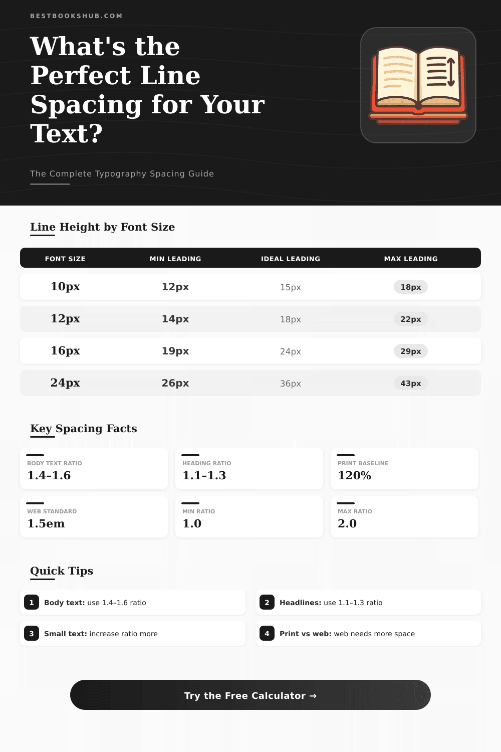
| Font Size | Min Leading (1.2) | Normal (1.5) | Ideal Body (1.6) | Loose (1.8) | In Points (1.5) |
|---|---|---|---|---|---|
| 10px | 12px | 15px | 16px | 18px | 11.25pt |
| 12px | 14.4px | 18px | 19.2px | 21.6px | 13.5pt |
| 14px | 16.8px | 21px | 22.4px | 25.2px | 15.75pt |
| 16px | 19.2px | 24px | 25.6px | 28.8px | 18pt |
| 18px | 21.6px | 27px | 28.8px | 32.4px | 20.25pt |
| 20px | 24px | 30px | 32px | 36px | 22.5pt |
| 24px | 28.8px | 36px | 38.4px | 43.2px | 27pt |
| 32px | 38.4px | 48px | 51.2px | 57.6px | 36pt |
| 48px | 57.6px | 72px | 76.8px | 86.4px | 54pt |
| Points (pt) | Pixels (px) | Em (at 16px base) | Rem | Percent |
|---|---|---|---|---|
| 8pt | 10.67px | 0.667em | 0.667rem | 66.7% |
| 9pt | 12px | 0.75em | 0.75rem | 75% |
| 10pt | 13.33px | 0.833em | 0.833rem | 83.3% |
| 11pt | 14.67px | 0.917em | 0.917rem | 91.7% |
| 12pt | 16px | 1em | 1rem | 100% |
| 14pt | 18.67px | 1.167em | 1.167rem | 116.7% |
| 16pt | 21.33px | 1.333em | 1.333rem | 133.3% |
| 18pt | 24px | 1.5em | 1.5rem | 150% |
| 24pt | 32px | 2em | 2rem | 200% |
| Medium | Body Ratio | Heading Ratio | Min Font Size | Notes |
|---|---|---|---|---|
| Web (Desktop) | 1.4–1.6 | 1.1–1.3 | 16px | WCAG recommends 1.5 |
| Web (Mobile) | 1.4–1.5 | 1.1–1.2 | 16px | Avoid zoom triggers |
| Print / PDF | 1.2–1.4 | 1.0–1.2 | 9pt | 120% standard baseline |
| eBook / Kindle | 1.4–1.6 | 1.1–1.3 | 12pt | Adjustable by reader |
| Presentation | 1.2–1.5 | 1.0–1.2 | 18pt | Optimize for distance |
| Mobile App | 1.4–1.5 | 1.1–1.2 | 14sp | Follow platform HIG |
| Code / IDE | 1.3–1.5 | 1.0–1.2 | 12px | Monospace preferred |
| Newspaper | 1.1–1.3 | 1.0–1.1 | 8pt | Tighter columns |
Line spacing is the vertical distance between lines. It measures the space between the base of one line and the next. If you set that space well, the text becomes more readable and easily scannable.
DISCLOSURE: This post may contain affiliate links, meaning when you click the links and make a purchase, I receive a commission. As an Amazon Associate I earn from qualifying purchases.
Most writers use either single or double spacing because those are the main choices in word processors
What Is Line Spacing and How It Helps
You call single spacing “1.0”. It simply lays a new line directly under the last, with small space between the letters. In most texts, that space is the same width as the line itself.
In a Word document, the standard spacing is single, which means 12 points between lines, with default font as Times New Roman or Calibri, depending on the version.
Double spacing is standard in many scripts, especially in legal documents. That means 24 points per line or three lines per inch. Sometimes you print text like this so that it is more easily readable.
Editors and teachers commonly require double spacing, so that they have enough place between the lines to add corrections or notes. The APA Style requires double spacing for every part of the paper, including the summary, the text, block quotations, tables, figures, titles and the reference list.
There is no alone strict rule about spacing, but 1.5 is widely favored. The goal of that space is to reduce the tiredness of the eyes during reading. It helps the reader glide easily from line to line, making the process more pleasant.
For screens, spacing of 1.5 reduces the need to scroll, but preserves the readablity.
Broad line spacing can make text much more readable, while tight space allows you to put more text on the page. More white space can slow the reading, but it creates a more light and open feeling in the text block. Even so, too much space can cause problems with continuity.
Too much strain is not ideal, although it can be a stylistic choice together with the margins and the size of the paper.
Typographers do not call that “line spacing”, but “leading“. Good leading depends on the font style, the size of the upper and bottom parts of the letters and the physical size of the text on the page. Together with the font size and type, it is one of the most important settings of textAlign.
Unless you print a mass market pamphlet and must squeeze the words, giving the lines a bit of “breathing space” is a good idea. Depending on the font, the spacing should be between 1.1 and 1.5. In a well designed book, every line of the left-hand page lines up with the corresponding line on the right, independently of titles, intervals or images.