📋 Outline structure tool
Nested list depth calculator
Paste a Markdown, HTML, or plain-text outline to measure its deepest level, item distribution, branch complexity, and readability risk.
Use these tables to interpret the calculator output for documents, knowledge bases, navigation menus, and edited manuscripts.
| Detected depth | Common use | Reader effect | Typical edit |
|---|---|---|---|
| 1 level | Flat checklist, short contents | Fastest scan path | Keep order meaningful |
| 2 levels | Grouped notes, article outlines | Clear parent-child relation | Use parallel labels |
| 3 levels | Documentation, course modules | Detailed but still navigable | Check parent summaries |
| 4 levels | Specifications, legal clauses | Needs careful labeling | Split repeated branches |
| 5+ levels | Dense policy or API trees | Easy to lose context | Promote branches to headings |
| Format | Depth signal | Strong example | Watch for |
|---|---|---|---|
| Markdown bullet list | Leading spaces before markers | Two or four spaces per child | Mixed tab and space indents |
| Markdown ordered list | Indent plus numbered marker | 1., 2., 3. with child lines | Auto-renumbered copied text |
| HTML ul or ol | Nested list elements inside li | Parent li contains child ul | Invalid closing tags |
| Plain outline | 1.2.3 hierarchical numbering | 1, 1.1, 1.1.1 | Numbers used as labels only |
| Scenario | Useful max | Sibling target | Reason |
|---|---|---|---|
| Blog post outline | 3 levels | 5 per parent | Keeps sections easy to draft |
| Book chapter plan | 4 levels | 6 per parent | Allows scenes, notes, and subpoints |
| Knowledge base article | 3 levels | 6 per parent | Supports quick scanning |
| Navigation menu | 2 levels | 7 per parent | Limits hidden choices |
| Technical specification | 5 levels | 8 per parent | Handles formal subclauses |
| Problem pattern | Calculator signal | What it means | Cleaner structure |
|---|---|---|---|
| Deep tunnel | One branch reaches 5+ | Important point is buried | Promote that branch |
| Wide parent | Many siblings at one level | Reader faces a long scan | Create subgroups |
| Mixed markers | Parser detects inconsistent levels | Copied formatting may be noisy | Normalize indentation |
| Flat dense list | Depth 1 with many items | No visible grouping | Add parent categories |
DISCLOSURE: This post may contain affiliate links, meaning when you click the links and make a purchase, I receive a commission. As an Amazon Associate I earn from qualifying purchases.
That’s what you do when outlining some knotty bit of technical guidance for the very first time: “Thorough,” you say to yourself. You go so deep as to make a tree diagram; you have so many levels of indenting going on that by the fourth or fifth you’re unable to focus any longer. Bullet point after bullet point, nested inside other bullet points, and somewhere in there is main idea. Oh, where did we put it? It is a mess of bullet points inside bullet points.
This is the classic trap of nested lists. You confuse depth with comprehensiveness. Every nuance get its own branch. But too much nesting almost always mean you’ve failed to logically group information. What was once a clear argument has become a scavenger hunt for contextual clues.
Why Deep Lists Are Bad
To help out with this, I wrote a tool (above) that will run these numbers for you, given any text you paste into it. It can parses either HTML, Markdown, or plain text and determine both the average and deepest level of your items. The latter, the maximum depth, is the critical number. If you have an outline that reaches down to four or five levels, chances are you’re requiring your reader to keep too many bits of context in working memory.
Humans only has so much attention. And when you push a list past its limit, the relationship between grandchild item and its parent topic grows weak. The reader loses track of why they’re looking at this particular detail.
By choosing indentation rules and source format, you control how your formatting appears. When you copy something it brings with it all sorts of baggage that is invisible to your eyes. Text dragged in from a word-processor could of been indented with spaces, tabs, or some crazy combination of both. It normalizes this: consistent indentation indicate hierarchy.
You can choose the number of levels deep it should go; the tool will then ding you for digging too deep. Past level 3, for example. This score does not reflect your writing quality. It is instead an indication of how easy it is to navigate. A higher score reflects that it shows your ideas fast. A lower score means the reader has to dig through layers of introduction before finding your main point.
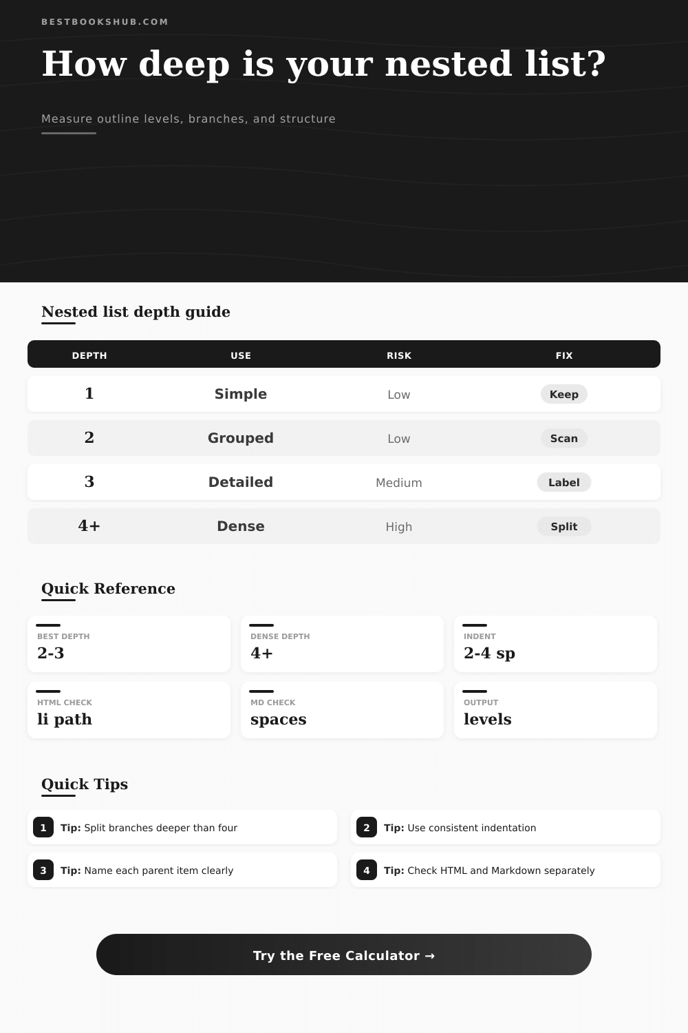
That is also spelled out neatly on the page in a table of references. As you can see, one or two levels are ideal for quick scanning. Two is about right for more thorough documentation. Three seems like a nice sweet-spot and after that things get expensive in terms of cognitive load. A note saying “dense depth” is really code for “hmm… maybe I have too many levels here.”
Maybe there should be a whole new section for that fourth-level thing? Or maybe it should go into a table, so you don’t have to nest stuff hierarchically under rows and columns. Another frequent remedy is to split up long parents with lots of siblings. If you’ve got ten sub-points under one category, it’s trying to do too much. Create sub-categories for those items instead.
People gets the inputs correct, but then they forget to consider the implications of outputs. They look at number of list items and think “more is better.” Wrong. Constraint is clarity. When you keep sibling lists manageable and limit the number of branches, you give your eye a chance to follow something in a way that doesn’t cause fatigue.
You start seeing the skeleton of your argument. You are free from extra words in your prose. You can see when the structure is solid. You can see when the structure is solid, or when it is top-heavy or bottom-light.
The takeaway: Your goal is never to flatten your idea but to organize it in a way that honors your reader’s time. A good list captures attention; it doesn’t scatter it.
After you’ve used this tool to create an outline, go back and scan through it again to find spots where the depth has crept up on you. Were these details necessary to make current point, or were they extra bits, dressed up into sub-points? Often, trimming away will reveal heart of the argument. Sometimes the best version of your outline is the simplest.
And that’s where folks screw things up. They assume complexity is a strength, when simplicity is actualy a feature in information design. Make your branches thin, your parents sturdy, and keep your readers comfortabley. Structure must serve the content, not hide it.