🔗 Social card text lab
Open graph description checker
Check an og:description for social preview length, Facebook and LinkedIn truncation, safe bands, keyword placement, line density, and UTF-8 character weight.
Facebook Feed
Best when the first sentence carries the hook and page topic without relying on the image.
~160 charsLinkedIn Feed
DISCLOSURE: This post may contain affiliate links, meaning when you click the links and make a purchase, I receive a commission. As an Amazon Associate I earn from qualifying purchases.
Works best with a direct professional value statement and fewer decorative characters.
~155 charsMessenger Shares
Often compact, so the first 80 characters should still make sense alone.
Short leadManual Override
Use custom caps when your CMS, campaign checklist, or internal QA rule is stricter.
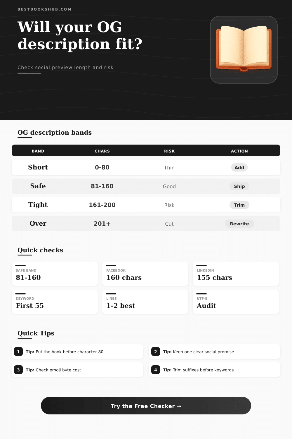
Custom| Fit band | Character range | Social signal | Recommended action |
|---|---|---|---|
| Empty or thin | 0-79 | Underexplained preview | Add a benefit, audience, or topic cue before publishing. |
| Safe social range | 80-160 | Strong feed-card fit | Publish if the keyword is early and the text reads naturally. |
| Tight range | 161-200 | Possible cutoff | Move the important phrase forward and trim a weak clause. |
| Likely overrun | 201+ | High truncation risk | Rewrite around one promise and one target reader. |
| Preview surface | Useful cap | What survives first | Copy cue |
|---|---|---|---|
| Facebook feed | About 160 chars | Opening sentence | Lead with the page promise, then support it. |
| LinkedIn feed | About 155 chars | Professional value | Use plain wording and avoid fluffy modifiers. |
| Mobile share | About 120 chars | Topic plus benefit | Make the first 80 characters self-contained. |
| Custom QA | Your chosen cap | Internal rule | Set caps to match your editorial checklist. |
| Keyword position | Placement signal | Risk level | Fix |
|---|---|---|---|
| 0-55 chars | Front-loaded | Low | Keep the phrase unless it sounds forced. |
| 56-100 chars | Visible but late | Medium | Move the topic phrase into the first clause. |
| 101+ chars | Likely hidden | High | Rewrite the opener around the keyword. |
| Missing | No direct match | Audit | Add the natural phrase or choose no keyword. |
| Density signal | Line pattern | Social effect | Best adjustment |
|---|---|---|---|
| Single clean line | 1 line | Easy preview | Best default for og:description tags. |
| Natural wrap | 2 lines | Still readable | Use only if the CMS preserves spacing. |
| Fragmented | 3+ lines | Can feel broken | Collapse breaks into one sentence. |
| Emoji heavy | High bytes | May crowd text | Use one symbol at most in social copy. |
Because social cards are your first chance at an impression with any piece of content, use this open graph description checker to see if it’s right: Is there room for keywords? Will it be truncated on Facebook and LinkedIn? How many lines is it? How long will it be in social previews? Does it include UTF-8?
Even with a compelling image and a great title, the copy below them do all the convincing to get someone to click through. Get description wrong and what could of been a good post looks cut-off, thin, off topic in feed. Typically just a few dozen characters make the difference between a truncated and safe-looking preview, and where you put the promise that makes it interesting.
Why Your Social Media Description Matters
The Open Graph description is in this weird limbo of “not the full first paragraph you’re reading on the page” but also “not the meta title optimized for search.” It’s simply for when somebody click share and their buddy glances down at their phone. This explains how important it is to get length right: these platforms needs to display enough context while avoiding one card taking over entire screen.
It creates a soft invisible ceiling that varies slightly by platform (Facebook vs LinkedIn) and device (desktop vs mobile). Here’s where it gets interesting: The magic number isn’t so much a byte count as it is a measure of how many visible characters it takes to display. Accented letters and especially emojis throw this all out the window. Just one smiley face might take up more space than you think! That’s where the byte count comes in, it subtly tells us if our friendly tone is slowly nudging the preview over the edge.
Ditto with keyword positioning. Social previews looks at the initial impression, while search engines consider the entire page. Chances are that by the time the main topic appear past the sixtieth character, most people will’ve made their mind up about how relevant the card looks.
Another silent killer is line density. Two clean sentences in your editor might render as three or four broken ones on platform. Each additional wrapping consume precious vertical space, leaving the card feeling cluttered. The cleaner the single flowing thought, the greater chance the full message will survive.
But write too short, and you run into your own problem. Thin descriptions leaves readers with no reason to care. The sweet spot is where one clear social promise fits comfortabley within safe band. It also needs to have room for a naturaly-sounding hook in the first line.
We see common errors all over the place. Some folks just copy-paste initial paragraph from their article, hoping for the best. Others cram as many keywords into their description as possible, resulting in content that sounds like it was written by a robot. The problem with both is that your feed rewards momentum and clarity. A good, solid benefit statement earlier then later wins out over a laundry list, hands down.
The same goes for the suffix. Words such as “Read more” or “Full guide inside” should be saved for the actual page. They hardly ever help in preview mode (and tend to push valuable context beyond truncation line).
But then you think of your audience and it shifts everything. What will work for the professional updating her LinkedIn network won’t necessarily work for book-club organizer. Someone might find it too corporate. The other might find it too casual.
Try out several descriptions, fast. Which one works best? When do you start seeing patterns? Eighty-character hooks tend to last across platforms. Vague summaries don’t perform as well than sentences constructed around one clear benefit. Small observations, yes. But they compound.
The thing about the best ones is, they restrain themselves. They put the topic front-and-center. They give only one reason for the reader to care. They don’t waste any bytes on extra decorations. This isn’t an exercise in telling the whole story. It’s an exercise in sparking just enough curiosity that someone click your card.
If you accept that limitation, you’ll find yourself writing to it almost instinctively. But ultimately, that’s just a small slice of real estate with big impact. Treat it like premium billboard space instead of just leftover SEO fluff and all those social cards will work even harder for you. Take the before and after previews; see the difference? One less emoji, a word shift, a couple careful trims, suddenly the card doesn’t feel cramped but confident. That confidence goes everywhere.