📖 Eye-to-text spacing
Reading distance calculator
Estimate a comfortable eye-to-text distance for books, ebooks, study pages, PDFs, and screens using text size, viewing task, lighting, posture, and vision profile.
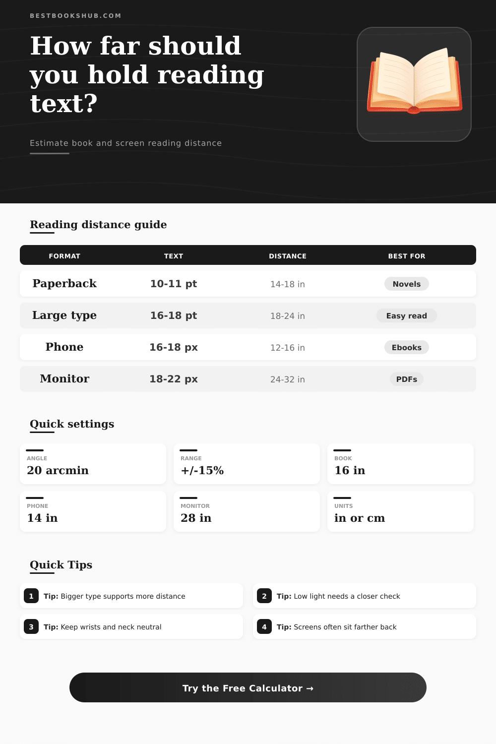
| Reading format | Typical text size | Common distance | Calculation note |
|---|---|---|---|
| Mass market paperback | 9-10 pt print | 12-16 in / 30-41 cm | Closer viewing often compensates for compact type. |
| Trade paperback or hardcover | 10.5-12 pt print | 14-20 in / 36-51 cm | Works well for normal lap or handheld reading. |
| Large print edition | 16-18 pt print | 18-28 in / 46-71 cm | Larger cap height supports a longer comfortable distance. |
| Phone ebook | 16-19 px screen text | 12-18 in / 30-46 cm | Screen zoom and margins change the result quickly. |
| Tablet or e-reader | 18-24 px screen text | 16-26 in / 41-66 cm | Use a stand when distance moves beyond handheld comfort. |
| Desktop PDF | 18-24 px screen text | 24-34 in / 61-86 cm | Increase zoom if the target distance feels too close. |
| Text size basis | Approximate cap height | Comfort angle | Best use |
|---|---|---|---|
| 10 pt print | 2.5 mm | 20 arcmin | Compact paperback and notes. |
| 11 pt print | 2.7 mm | 20 arcmin | General book pages and essays. |
| 14 pt print | 3.5 mm | 20-22 arcmin | Study sheets and easier reading. |
| 18 px screen | 3.3 mm | 20-22 arcmin | Phones, tablets, and web articles. |
| 22 px screen | 4.1 mm | 20-22 arcmin | Desktop PDFs and large ebook text. |
| Adjustment | Effect on distance | Why it matters | Calculator handling |
|---|---|---|---|
| Deep reading | Slightly closer | More detail and sustained focus need larger apparent text. | Raises the visual angle target. |
| Reduced near clarity | Closer or larger text | Small letters need more angular size to remain clear. | Applies a stronger vision factor. |
| Dim lighting | Slightly closer | Lower contrast makes letter detail harder to resolve. | Raises the required angular size. |
| Book stand | More flexible | A raised page can sit farther away without neck strain. | Adds a posture allowance. |
| Desktop screen | Often farther | Screen ergonomics usually place text beyond handheld range. | Uses a screen-specific minimum. |
| Posture | Comfort band | Works best with | Watch for |
|---|---|---|---|
| Handheld book or device | 12-20 in / 30-51 cm | Paperbacks, phones, small e-readers | Wrist bend, hunched neck, and glare. |
| Flat desk or table | 14-24 in / 36-61 cm | Textbooks, notebooks, worksheets | Leaning forward when text is too small. |
| Book stand or raised page | 16-28 in / 41-71 cm | Study reading and annotation | Page angle and lighting consistency. |
| Upright screen | 22-34 in / 56-86 cm | Monitors, desktop PDFs, research articles | Zoom level if text looks small. |
| Reclined reading | 14-22 in / 36-56 cm | Large print, tablets, casual reading | Arm fatigue and unstable distance. |
DISCLOSURE: This post may contain affiliate links, meaning when you click the links and make a purchase, I receive a commission. As an Amazon Associate I earn from qualifying purchases.
When you read long articles on your phone or hold a book too close, you probably notice the text blurs and then your neck hurt. It’s an ergonomic problem, most people figure it out accidentally, usually after experiencing some neck pain as their warning signal. You want to be able to see words clearly without hurting your body.
But you don’t need to guess what’s comfortable: Plug in your viewing conditions and your text size into the calculator above, and it do the math for you. It turns physical size of the letters into the visual angle they occupy in your field of view. If the angle is too small, your eyes has to work harder; if it’s too large, you have to hold the object uncomfortably close. This tool calculates the sweet spot where an object is physically comfortable yet still clear.
How This Calculator Works
Reading distance is variable, and vary with fatigue level and what you’re doing. To account for this, you can tweak it depending on if you are scanning headlines or deeply reading something like a thick textbook. Deep reading suggests sitting closer due to sustained focus which means bigger apparent text reduce strain. That little difference makes a huge difference if you spend an hour staring at a screen.
The other thing the calculator takes into account is where you place your book: Lighting matter a lot. When it’s dim, your vision adjusts by compensating with contrast, getting closer until you can see fine details. This is why the calculator suggest a smaller distance for lower-light environments. It won’t make you hunch unnecessarily in bright rooms, but will recognize that you’ll be leaning in when things get darker.
But there’s another factor that spoils best intentions: posture. Holding a book by both hands make it too heavy to hold up for long, but putting it on a book stand lets you lean back while maintaining a constant distance from the page. Holding it by hand would of require a tighter range, making it closer and less flexible. The fact that you’re holding it at arm’s length yet reading at a comfortable distance suggest that something mechanical is doing the work. This is why tablets is sometimes more pleasant when propped on a desk than held in two hands, even though they might display exactly the same amount of screen.
Pixels are not like ink on paper; they have their own quirks when it comes to screens. High-res screens may beg you to stand further away, and glare can wash out contrast and make you get closer instead. The calculator accounts for such medium-specific qualities. For example, it knows your phone screen is intimate and close, whereas a monitor on your desktop is typically at arm’s length or longer. If you ignore that distinction, the result is neck strain, which all too often is the true cause of reading fatigue, different than eye strain per se.
While there are handy reference tables at the bottom of the page, real numbers mean more. No two sets of eyes is alike; for instance, some people have sharper corrected vision, while others deal with reduced near clarity as they age. You can plug in your own profile of vision and adjust the outcome from there. This isn’t a doctor’s diagnosis, but it makes sense based off each person’s biology.
It should be easy to read: If you are finding yourself rubbing your eyes or shifting position frequently, that means the distance isn’t correct. Take the range from above and use it as a starting point; adjust from there according to what feels best for your body. You want it to just go away, allowing you to get lost in the story instead of the setup. Set the distance correctly, and the words will carry you away.