💬 Subtitle QA bench
Subtitle line length checker
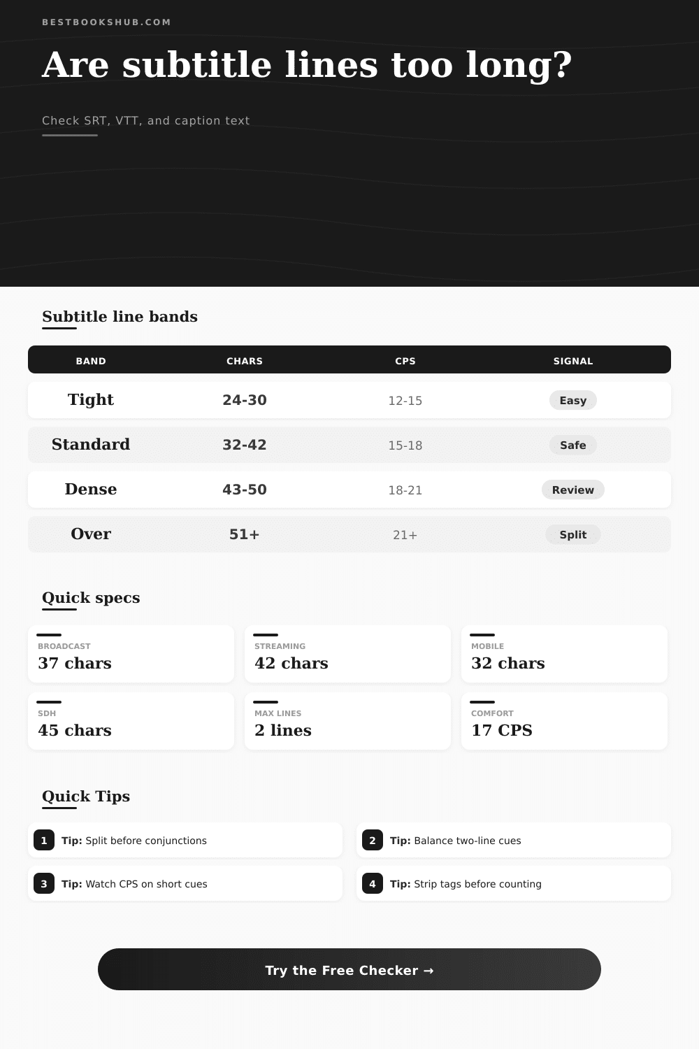
Paste SRT, VTT, or plain subtitle text to measure character caps, two-line balance, over-limit lines, and reading comfort.
| Use case | Line cap | Lines per cue | Review signal |
|---|---|---|---|
| Broadcast captions | 32-37 characters | 1-2 | Split anything that crowds the safe title area. |
| Streaming subtitles | 37-42 characters | 1-2 | Good default for dialogue on normal screens. |
| Mobile-first subtitles | 28-32 characters | 1-2 | Use shorter lines to avoid tiny text wrapping. |
| SDH captions | 40-45 characters | 1-2 | Allow room for speaker labels and sound cues. |
| Festival or cinema captions | 42-50 characters | 1-2 | Wider screens tolerate longer lines, but balance still matters. |
| Band | CPS range | Line pattern | Typical action |
|---|---|---|---|
| Relaxed | 10-14 CPS | Short one-line cues | Keep timing unless the cue lingers awkwardly. |
| Comfortable | 15-18 CPS | Balanced one or two lines | Good target for most subtitle exports. |
| Dense | 19-21 CPS | Long two-line cues | Trim filler words or extend timing. |
| Hard to read | 22-25 CPS | Fast dialogue or stacked clauses | Condense, split, or retime the cue. |
| Critical | 26+ CPS | Long text in short exposure | Rewrite before delivery review. |
| Difference | Example lengths | Balance result | Adjustment cue |
|---|---|---|---|
| 0-4 characters | 31 / 33 | Very even | Leave the line break alone. |
| 5-8 characters | 28 / 36 | Usually fine | Check phrase boundaries and punctuation. |
| 9-14 characters | 22 / 36 | Uneven | Move a short phrase to the lighter line. |
| 15+ characters | 15 / 38 | Poor balance | Rewrite or split the cue. |
| Format | Ignored lines | Counted text | Best for |
|---|---|---|---|
| SRT | Cue numbers and timecodes | Visible subtitle rows | Delivery files and editor exports |
| WebVTT | WEBVTT header, notes, and cue timing | Caption text after cue metadata | Web video captions |
| Plain text | Blank rows only | Every nonblank line | Draft line-break review |
| Tagged captions | HTML-like tags when strip mode is on | Readable text after markup cleanup | SDH and styled captions |
DISCLOSURE: This post may contain affiliate links, meaning when you click the links and make a purchase, I receive a commission. As an Amazon Associate I earn from qualifying purchases.
If you’ve ever watched something with subtitles that appear as a paragraph, I’m sure you know what I mean. There are characters running around onscreen and then three seconds later there’s this subtitle that stays on the screen for all those seconds. You don’t get what’s happening because you’re trying to read sentence. And now you’ve missed point of whatever was just shown.
Timing and translation aren’t often the issue. More often than not it’s how it’s laid out. Either the subtitle writer has crammed too many words into one line, or they have divided a sentence in an unnatural way. This force the viewer to choose between reading the subtitle or watching action on screen. They can’t do both.
How to Make Subtitles Easy to Read
A decent subtitle line length checker will pick up on mistakes like this before they gets to the public.
Most people miss this one: Character limits aren’t arbitrary (they’re not!). They’re based off the way the human eye moves. On a computer or phone screen, when we read, our eyes move from left to right across the line. When the line becomes too long, the eye travel too far, and by the time we reach the end of the sentence, the brain has trouble remembering what was at the start.
Once you put your text into the calculator above, it do the math for you, which saves you the guesswork on conversions and coefficients. More important than knowing how many characters to keep under the cap, though, is an understanding of why they exist.
Most standard streaming limits hovers around forty-two characters. That gives enough space to read comfortabley at a good speed without forcing us to scan back and forth while viewing. For broadcast television, the safe zone becomes about 37 characters long. Smaller safe title spaces and older displays needs a bit more padding. Think of these as guidelines for readability, don’t take them as set in stone.
The other issue is balance. Two-line subtitles makes it very tempting to put the beginning of each sentence on the first line and the remainder on the second. But then, if the first line contains a ten-character phrase while the second contains a forty-character phrase, that doesn’t feel right visually. Symmetry matter. Uneven lines result in a sort of jolt to the viewer’s brain, even though we don’t notice consciously.
The tool help with that. It will flag cue points that feel like there’s too big a difference from one line to the next. Ideally you’ll be splitting phrases naturaly. Split before the conjunction. Split after the comma. Don’t split a proper name. It’s a small thing, but it makes a difference.
And the key is knowing what the tool is measuring, because it isn’t simply about cramming words into a space. It’s about how our brains process the visual information.
The other silent killer of subtitle quality is reading speed. Perfectly balanced lines and perfectly tuned character counts are worthless if they are onscreen for half a second. This is where characters per second come in. Generally speaking, about seventeen characters per second is comfortable. Faster then that (twenty or so) begins to feel like a race.
The worst offenders are fast dialogue scenes. In these moments, actors talk very quickly, and you feel the urge to keep all their words. But this isn’t a transcript. Subtitles aren’t meant to match exact timing of the spoken words. You can simplify complex phrasing. Eliminate filler words. Condense them. The point is to convey meaning, not the exact wording.
If you’re repeatedly bumping up against hard-to-read threshold, it’s probably not because of font size; it’s because the script itself is dense. And then there’s context… What are you watching?
If it’s a big-screen movie in a theater, you have more latitude than if it’s on a small mobile device. On the one hand, a big screen may accommodate forty characters per line quite nicely; on a phone, that might wrap awkwardly or appear tiny. Or maybe it’ll look too small. On a phone, think about keeping your lines down to around thirty characters.
Even more careful consideration applies if you’re captioning with audio description, which will be added to SDH captions (for speakers) when available: they use mental effort and also occupy space. Reserve some of that space for the viewer’s brain to figure out where things are taking place, and who is saying what. Don’t overwhelm them with words!
The page has a reference table to illustrate these various parameters, and how much tolerance is required for each. It’s not a law, but it could of serve as a guide. But ultimately, good subtitling is an act of empathy.
The reader is watching a film while reading subtitles. Their attention is divided between two different things, and you’re designing their reading experience. You want it to be effortless so that they remain engaged with the story.
Check your line length. Balance your splits. Respect the readers’ reading speed. If you do this, the text will dissapears; there’ll only be a story left. You want the viewer to forget they’re even reading anything.