📖 Book positioning tool
Tagline length checker
Measure a book tagline against cover, subtitle, banner, back-cover, and social placement targets using character count, word count, line fit, and skim-time formulas.
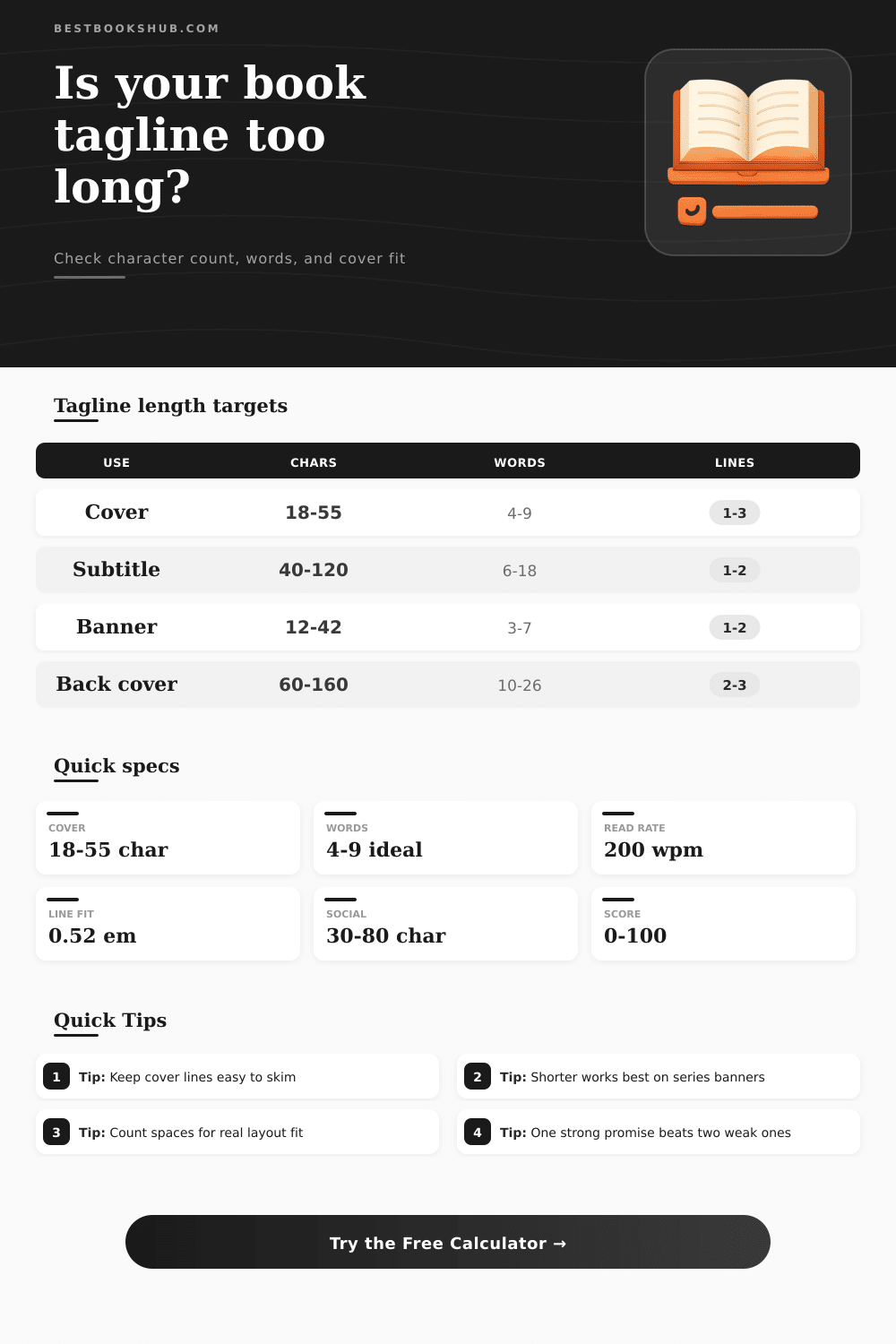
| Placement | Character target | Word target | Best use |
|---|---|---|---|
| Book cover tagline | 18-55 chars | 4-9 words | Fast promise above or below the title |
| Online subtitle line | 40-120 chars | 6-18 words | Searchable benefit or positioning phrase |
| Series banner | 12-42 chars | 3-7 words | Short recurring phrase across multiple covers |
| Back-cover hook | 60-160 chars | 10-26 words | Longer setup for browsing readers |
| Ad headline | 20-60 chars | 4-10 words | Clickable hook for a campaign image |
| Pinterest pin title | 30-80 chars | 5-12 words | Readable text overlay on a vertical pin |
| Genre shelf | Cadence target | Common pattern | Length note |
|---|---|---|---|
| Thriller or mystery | 4-8 words | Threat, secret, deadline | Short punchy clauses scan fastest |
| Romance | 5-10 words | Emotion, contrast, promise | One emotional turn is usually enough |
| Fantasy or sci-fi | 5-11 words | World, power, stakes | Unfamiliar names need extra space |
| Memoir | 5-12 words | Life shift, voice, meaning | Clarity matters more than cleverness |
| Nonfiction or business | 6-12 words | Audience plus result | Benefit-led lines can run longer |
| Middle grade | 3-7 words | Adventure, humor, danger | Short concrete words read best |
| Typography setting | Width factor | Approx. formula | Layout effect |
|---|---|---|---|
| Compact serif or condensed sans | 0.48 em | line width / font x 0.48 | Fits more characters per line |
| Standard book display type | 0.52 em | line width / font x 0.52 | Balanced default for covers |
| Bold cover type | 0.56 em | line width / font x 0.56 | Needs fewer words per line |
| Wide display lettering | 0.60 em | line width / font x 0.60 | Best for very short taglines |
| Tagline format | Typical length | Strength | Watch point |
|---|---|---|---|
| Question hook | 25-70 chars | Creates curiosity quickly | Too many questions feel vague |
| Promise line | 35-90 chars | Clear benefit or emotional payoff | Abstract nouns can slow the skim |
| Stakes sentence | 45-120 chars | Works for plot-driven books | Long clauses may break badly |
| Series identity | 12-42 chars | Easy to repeat across covers | Needs strong rhythm when short |
DISCLOSURE: This post may contain affiliate links, meaning when you click the links and make a purchase, I receive a commission. As an Amazon Associate I earn from qualifying purchases.
There comes a point of sheer terror: after hours of agonizing over a tagline, you create a mock-up of your book, place it a few inches away and squint, does it look like a blob of gray ink? Did that line you worked so hard to perfect and capture the heart of your story break into several lines at thumbnail size? Design is mathematics, and gut feelings seldom translate well from screen to page. Pay attention to actual limits of your copy because precise measurement are essential for visual clarity.
This tool makes math easy. By taking the abstract word count and making it concrete (fitting lines & characters), you can plug in the few pieces of information that most author leave until it’s too late: What is my font point size? What is the usable width in inches? These aren’t random numbers. They are real numbers that show actual space on your book cover, such as a typical 6 x 9 trade paperback or something bigger like mass-market.
How to Use the Tagline Calculator
By plugging in your tagline, this calculator determine if your phrase will actualy fit inside the safe-zone of your cover design or be so crammed it vanishes altogether. It connects dots between what you intend to say and how much space is available.
What about the distinction between a memoir promise versus a thriller hook? One of the ways a mystery title use a reader’s emotions is through urgent, staccato sentences, and guess what? They’re all in the four- to eight-word sweet spot. When we’re stressed, our brains process fragmented information at quicker pace, making the lines snap off the page. By comparison, a nonfiction business title must make its benefit clear (typically requiring more syllables to spell out the change it promises for reader). The chart on the page plots this genre-driven pattern: Science fiction readers seeks world-building stakes; romantics want an emotional resonance; etc. Know these tendencies and you’ll craft text that connects with your target but also feels fresh.
But typography plays a larger role than most authors realize. For example: a narrow sans serif font hold a greater number of characters per line than something like a wide display font; but it’s not as visually interesting. And if your book title is a big, attention-grabbing headline, your tagline should of be much shorter then usual to keep things looking balanced. The character counter takes this into account. Choosing a style with a wider or narrower width automatically re-calculates the character count to match, since some letters take up more or less room horizontally than others.
What appears nicely spaced and readable on your computer screen will probably overflow or get lost altogether in miniature form. And then there’s the digital home of your book itself. Your cover is just one small square among dozens of other on sites like Amazon or Barnes & Noble. A lengthy tagline will become visual noise, something the browser scrolls right past without noticing. The shorter your line, the more its shape hold up during shrinking. Translating into readable icons at icon size. This isn’t a place to linger: you’ve got a couple seconds for a skim-through, and each additional word steal attention from those precious few moments.
How you use it: Where you put the text can change everything. A front-cover tagline is an instant hook; if it doesn’t stop someone’s thumb in its tracks, they scroll past. The back cover gives you some breathing room; you can set up something that makes people curious without needing them to find answers right away. The same applies to a series banner. It has to work the same way on several books, so it tends to favor rhythm and a certain amount of shortness over deep explanatory detail. If you’re creating copy that might show up as part of a book pin on social media, or an email header, etc., remember that each platform has its own strict character limit and you want to avoid having your line truncated.
In the end then: how do you edit your tagline? Do it subtractively. Fewer words = stronger promise. Because direct is better than indirect, one good sentence > two weaker sentences any day. And if you run all your possibilities past a word-count app before sending anything to print, you won’t waste money designing a whole new label just because the copy didn’t fit. Your finished product will be as certain on the shelf as it was in your head. Always remember: Direct wins; Clever for the sake of being clever doesn’t. When it fits, it breathes.