📐 Visual reading size lab
Text size for distance calculator
Estimate readable font size from viewing distance, visual angle, x-height, screen density, and reader needs for pages, labels, signs, slides, and displays.
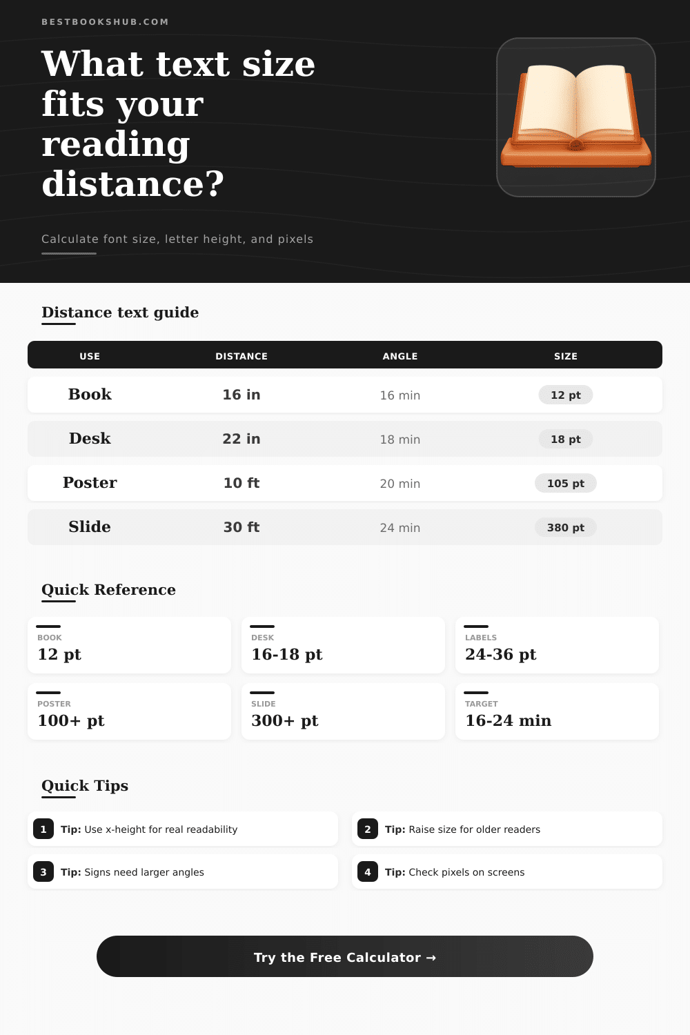
| Reading situation | Typical distance | Target x-height angle | Practical note |
|---|---|---|---|
| Printed book page | 14-18 in | 14-18 arcmin | Good book text depends on face, leading, and line length. |
| Desk manuscript or worksheet | 20-26 in | 16-22 arcmin | Editing pages often need larger type than finished books. |
| Shelf label or exhibit tag | 2-4 ft | 18-26 arcmin | Readers scan quickly and may stand off-axis. |
| Classroom poster | 8-15 ft | 20-30 arcmin | Use larger headings when readers are moving. |
| Presentation slide | 20-40 ft | 22-36 arcmin | Back-row readability needs much larger text. |
| Low-vision print | 12-20 in | 28-45 arcmin | Use generous leading and strong contrast. |
| Font style | X-height ratio | Cap ratio | How it changes size |
|---|---|---|---|
| Low x-height serif | 0.46 em | 0.68 em | Needs more point size for the same lowercase readability. |
| Book serif | 0.50 em | 0.68 em | Useful default for novels, manuscripts, and print pages. |
| Neutral text face | 0.52 em | 0.70 em | Good general estimate when the exact typeface is unknown. |
| Readable sans | 0.55 em | 0.72 em | Often reads larger at the same point size. |
| Large x-height UI | 0.58 em | 0.75 em | Common in interface fonts and screen-first layouts. |
| Distance | 16 arcmin text | 24 arcmin text | 36 arcmin text |
|---|---|---|---|
| 16 in book distance | 12 pt | 18 pt | 27 pt |
| 24 in desk distance | 17 pt | 26 pt | 39 pt |
| 3 ft label distance | 26 pt | 39 pt | 58 pt |
| 10 ft poster distance | 86 pt | 129 pt | 194 pt |
| 30 ft slide distance | 259 pt | 388 pt | 582 pt |
| Adjustment | Size multiplier | Use when | Design check |
|---|---|---|---|
| Standard reader | 1.00x | High contrast text in normal light | Validate with real copy, not only headings. |
| Mature reader | 1.12x | Older audience or extended reading | Preserve line height and avoid tight tracking. |
| Low light | 1.25x | Dim rooms, evening reading, muted ink | Increase contrast before shrinking margins. |
| Accessibility | 1.40x | Public instructions or mixed ability readers | Check the longest words and line breaks. |
| Low vision | 1.60x | Large-print or aided reading contexts | Use plain layouts and generous spacing. |
DISCLOSURE: This post may contain affiliate links, meaning when you click the links and make a purchase, I receive a commission. As an Amazon Associate I earn from qualifying purchases.
How many times have you been in a presentation with unreadable font in the back of the room? “The presenter was great,” you think. “If only I could see the content.” You crane your neck, pull closer, squint. Nope. That’s not vision impairment; it’s ignoring basic physics. To read comfortabley, there needs to be adequate angle AND light for meaning to be understood without effort.
Enter the calculator, which does the math when you enter the desired target angle and viewing distance. So you don’t guess at what size (twelve point?) will work from thirty feet. The visual angle are measured in arcminutes and is the amount of space that a letter take up in your field of view. The bigger the angle, the easier it will be to recognize.
Why Text Size Matters for Reading
Software show us point size, which is what most people zero in on. But point size is arbitrary… It’s completely dependent on the typeface you use. You could set two fonts to 12 points and their lowercase heights would differ. One could feel cramped, while another could feel spacious. So the tool ask for an x-height ratio. That’s the factor that brings the raw point size to match the real-world height of lowercase letters. It connects abstract design units to biological reality.
Take the example of a printed book sitting some sixteen inches from your eyes. Twelve-point type with a normal serif font occupy an angle of around sixteen arcminutes, which is comfortabley readable for long periods. Shift that same copy to a poster ten feet up on a wall. To stay at twelve points (and retain legibility), it would of have to be huge; perhaps a hundred points or more! Leave it at twelve points and the angle would drop to under one arcminute. You’d be looking at a smear of ink rather than words.
As the above table show, size depends much more on distance different than it does on medium. The other wrinkle is in screen design. Because pixels vary based off density, there’s no set size for them. For example, if you use a high-pixel-density tablet, it will be able to display crisp text even at smaller sizes because the individual pixel are bunched closer together. On a lower-res projector, those same pixels is spread out over a bigger space. To adjust for this, you’re able to input your screen or export PPI so that whatever appears nice on your monitor will look right when printed or displayed on something else. In other words, don’t design something that looks good on your desktop only to have it look bad on a big screen.
The distance isn’t everything. The environment matter too. If it’s low-light, your eyes’ pupils has to open up to let in more light, so it’s less sharp. If it’s glossy, that glare washes out the contrast, so bigger text compensate for the lack of detail. That’s why the tool has an adjustment called “reader” that adds a multiplier. But it’s not only for the benefit of older readers. In the real world, we rarely have perfect lighting or a lot of contrast. A sign in a dim hallway need more size than a label on a bright desk.
For many designers, it’s a matter of habit, they grab whatever fonts is available and fit as much on the page as possible: a ten-point body type because there is more of it. They jam in the margins because it looks good. But readability isn’t about fitting words; it is about sharing information clearly. And if you stumble over something, you don’t read anymore.
Mostly it’s a question of what we’re measuring. It is not the point size or the cap height; it is how far that x-height are from that distance. If you’re printing out a manual or setting up a slide deck, use an actual measuring tape to see how far away people will be sitting from it. Don’t guess based on size of room. Stand where your audience will be standing and make sure they can read it in normal lighting. If in doubt, go for bigger. It won’t hurt understanding (though a font that’s too small certainly will).
This tool just gives you a starting point; it’s up to humans to make the final decision. Typography is typicaly viewed as just a matter of style and mood, a choice of fonts. However, at heart it’s also an interface: an interface from mind to eye. Without the eye capturing the signal, the mind have no message to process. This isn’t about decoration; this is about respect for the reader’s effort. So why does size matter? Clarity makes all the difference.