🔤 Typographic Scale Calculator
Generate a harmonious type scale from any base size & ratio — get px, rem, and pt values for every step
⚡Quick Presets
⚙️Scale Settings
✅ Your Typographic Scale
DISCLOSURE: This post may contain affiliate links, meaning when you click the links and make a purchase, I receive a commission. As an Amazon Associate I earn from qualifying purchases.
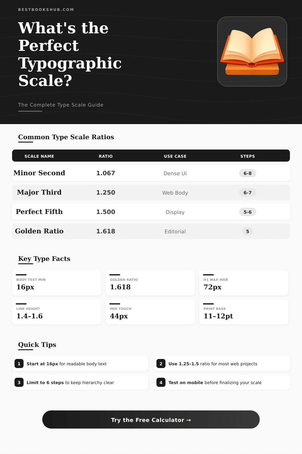
📊Scale Ratio Reference
📋Scale Steps at Common Base Sizes
| Step | Base 14px / 1.25 | Base 16px / 1.25 | Base 16px / 1.333 | Base 18px / 1.618 |
|---|---|---|---|---|
| h6 / xs | 11px | 13px | 12px | 11px |
| h5 / sm | 14px | 16px | 14px | 14px |
| h4 / base | 14px | 16px | 16px | 18px |
| h3 / md | 18px | 20px | 21px | 29px |
| h2 / lg | 22px | 25px | 28px | 47px |
| h1 / xl | 27px | 31px | 38px | 76px |
| display | 34px | 39px | 50px | 123px |
📐Unit Conversion Reference
| px | rem (root 16px) | pt | em (parent 16px) | Typical Use |
|---|---|---|---|---|
| 10px | 0.625rem | 7.5pt | 0.625em | Caption / label |
| 12px | 0.75rem | 9pt | 0.75em | Small text |
| 14px | 0.875rem | 10.5pt | 0.875em | UI label |
| 16px | 1rem | 12pt | 1em | Body text (web default) |
| 18px | 1.125rem | 13.5pt | 1.125em | Large body / intro |
| 20px | 1.25rem | 15pt | 1.25em | Subheading |
| 24px | 1.5rem | 18pt | 1.5em | H3 |
| 32px | 2rem | 24pt | 2em | H2 |
| 48px | 3rem | 36pt | 3em | H1 |
| 64px | 4rem | 48pt | 4em | Display / Hero |
📖Common Project Type Scales
| Project Type | Base Size | Ratio | H1 Result | Recommended Steps |
|---|---|---|---|---|
| Blog / Article | 16–18px | 1.250 | ~39–44px | 5–6 |
| Marketing Site | 16px | 1.333 | ~57px | 6 |
| Web App / SaaS | 14–16px | 1.200 | ~29–33px | 6–7 |
| Editorial / Magazine | 18px | 1.618 | ~76px | 5 |
| Mobile App | 14px | 1.333 | ~33px | 5–6 |
| Print / PDF | 11–12pt | 1.125 | ~20–22pt | 6–8 |
| Dashboard / Data | 13–14px | 1.200 | ~27px | 5–6 |
💡Tips & Guidelines
Typographic scale is an ordered set of font sizes, where every size relates to the other by a fixed ratio. Choosing font sizes from such a scale helps to create harmony, consistency and contrast in typographic work It is a key concept of design, that allows a systematic way to set the sizes of the text. Basically, it is a set series of sizes, that works to create visual hierarchy in a design.
The main idea is, that the sizes follow a mathematical scale. Typographic scale starts with a base size, and then you use a ratio to define the bigger levels. Occasionally you dump messy values and keep only the whole numbers that the formula gives, or simply round them up.
What is a typographic scale
The first value is the base size. Later comes that base value multiplied by the ratio, and later again multpiled, and so on.
Most scales base on the size of the body text and expand from here. The classic scale from “The Elements of Typographic Style” is known to many designers, and those values commonly serve as starting points for new offers. In a normal scale, the relative proportions stay permanent between every level.
You should understand the contrast between the various levels when you choose a scale for a project.
You can choose the ratios carefully and with sense, searching inspiration in the history or the character of the source. Some popular scales include the “Major Third” and the “Perfect Fourth“. Bigger jumps between the sizes create stronger contrast, which usually gives a more dramatic impact.
The amount of contrast depends on how legible the main source is and how much difference you want between the titles and the body text.
Creating a responsive typographic scale can be a difficult task. Also the difference between website and printed paper alter the causes. One useful trick is to use “rem” units in CSS.
You can set up a scale, where every step is multiplied by the ratio. Then, instead of altering dozens of statements for every breakpoint, the whole scale moves up or down only by changing the font size in the html element. That makes the management of responsive design much more easy.
Using abstract concepts as the Golden Ratio for sizing type could sound modern, but that does not always help the text be more understandable. It only sounds fine when you say to others, that the scale is “Perfect Fourth”. More important is, that the text be legible and accomplish its goal.
In design, scale always helps to show the hierarchy. Every element on the page is connected, and thinking about them as separate items is commonly a mistake, because you forget how the visual information is consumed.
The height of the line should be a multiple of the text size, usually around 1.5 times. Grid typography is basically a chart or scale. A typographic point is one seventy-second part of an inch, and twelve points form a pica.
That value of one pica, that matches twelve points, is the standard size used in printed typography.