🔠 Caps density and acronym checker
Uppercase letter counter
Count uppercase letters, separate acronym-heavy text from shouting, adjust for sentence starts, and inspect A-Z capital patterns in one WordPress-safe checker.
| Letter | Uppercase Count | Share of Caps | Share of All Letters | Visual Weight |
|---|---|---|---|---|
| Paste text and run the counter to populate the letter table. | ||||
| Text Type | Typical Caps Share | Dominant Source | Checker Setting |
|---|---|---|---|
| Book prose paragraph | 2-8% | Sentence starts and names | Exclude sentence starts for tone |
| Academic abstract | 4-12% | Terms, proper nouns, abbreviations | Separate acronyms |
| Chapter title stack | 15-45% | Title case and display lines | Use title-case focus |
| Legal policy excerpt | 6-18% | Defined terms and party names | Report acronyms and all-caps words |
| Marketing caption | 8-28% | Emphasis, hashtags, brand names | Flag quoted or emphatic caps |
| Pattern | Example Shape | Counted As | What It Usually Means |
|---|---|---|---|
| Sentence-start capital | The first word | One uppercase letter | Grammar, not emphasis |
| Acronym | NASA or ISBN | All uppercase letters | Term density or metadata |
| All-caps word | STOP or NEVER | Word and letters | Emphasis or shouting risk |
| Title-case word | Every Major Word | Initial capital | Heading or book-title style |
| MixedCase word | WordPress or eBookPro | Internal capitals | Branding, code, or product style |
| Baseline | Low Band | Expected Band | High Band |
|---|---|---|---|
| Book prose | 0-2% | 3-8% | 9%+ |
| Academic abstract | 0-3% | 4-12% | 13%+ |
| Headline and title | 0-8% | 9-35% | 36%+ |
| Legal or policy text | 0-5% | 6-18% | 19%+ |
| Social caption | 0-6% | 7-22% | 23%+ |
| Technical notes | 0-5% | 6-20% | 21%+ |
| Comparison Check | Formula | Best Use | Common Trap |
|---|---|---|---|
| Raw uppercase count | Capital letters found | Exact editing targets | Ignores text length |
| Caps share | Caps / alphabetic letters | Compare drafts | Inflated by short samples |
| Adjusted caps share | Selected caps / letters | Tone and shouting review | Depends on exclusions |
| Caps per 100 words | Caps / words x 100 | Style consistency | Can miss short acronyms |
| All-caps word rate | All-caps words / words | Find emphasis clusters | Acronyms may be harmless |
DISCLOSURE: This post may contain affiliate links, meaning when you click the links and make a purchase, I receive a commission. As an Amazon Associate I earn from qualifying purchases.
Have you ever recieve an email that was aggressive? Maybe it had a lot of capital letters. Why does this make us feel something is wrong? The reason is because our brains processes all-caps words differently. They are signals to the eye, visual cues among otherwise-lowercase words on a page. Used well, they provide structure and tell the reader where to look, used poorly, they’re noise.
How much of your text should be in caps matter not only for spell-check purposes but also for controlling its visual volume. You can use this tool (above) to figure that out, too, no guesswork required. Most authors assumes people will understand their meaning from context, even though using a few capital letters is more emphatic than using none at all. We tend to overestimate how much we’re making ourselves understood by our chosen words.
How to Use Capital Letters Well
A marketing headline require a dash of caps to sound pressing; a technical manual becomes aggressive if acronyms stays all-capped. Finding where to draw the line between emphasizing key points and being clear about them is tricky. Before sending something off, should you of know whether you’ve written a whisper, a shout, or a yell?
One of the more difficult aspects of this analysis are distinguishing intent and grammar. A capital letter at the beginning of every sentence isn’t an expression of emotion; it’s a rule. You can end up thinking your prose is to emphatic when it’s simply following the rules of punctuation. To account for this, the calculator will let you omit the initial letters of sentences from your overall tone score. This gives you a clearer view of any extra emphasis you are adding beyond the basics of the language. It is a small distinction but it makes a big difference in accuracy.
Then there’s acronyms. CEO, SEO, API, these types of words crops up all over the place in business and scientific texts. On their own, they resembles shouts. But they’re practical tags that the tool can separate from emphasis signals. Turn them into stop or free and suddenly you’ve got an incorrect analysis. Your piece could be full of information, but you’re treating it as though it’s aggressive. Being able to separate the letters of an acronym from any emphasis signals lets you have a clearer read. It tells you which parts are really projecting and which parts is being used purely for description.
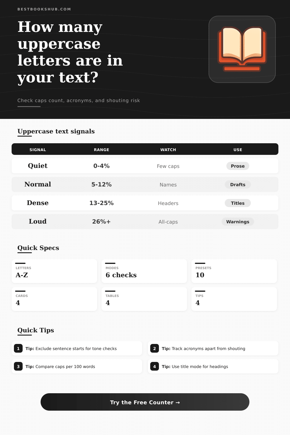
Normal depends on context. Higher capital use in a comment block isn’t rude. Expect higher caps if you’re writing a chapter title. It stands out and that’s good. It would be pointless to compare the same standard used based off a caption for social media with one used in a legal contract. They’re different genres. Use the reference tables in the tool to get a baseline for various kinds of text and then you’ll know what kind of range is typical for your particular genre. That keeps you from running after some generic number that doesn’t work in your medium.
Check All Caps is my favorite tool, and it is probably the most helpful when editing someone’s marketing copy or dialogue. If any words has all caps, it’ll flag them, usually indicating extra strong emphasis or even yelling/shouting. Too much of it will break the reader out of immersion in fiction. And in advertising, it may come across as spammy. Knowing there are clusters like this allows you to determine whether they’re deliberate emphasis or accidents. The brain tends to auto-correct the noise so that sometimes we don’t see the pattern until a second set of eyes comes along. A systematic count eliminates the blindness.
Writing well doesn’t require studying style guides. It requires someone to tell you which of your choices work (or don’t) visually. Doesn’t mean if you write lots of thing in high caps, it’s bad writing. Usually, though, it means you’d better go back and look at your formatting. Is it high caps because you’re using them as part of the structure, or because you panicked?
Sometimes it’s only a couple percent points of difference in the end result. Paste your draft in the counter up top and let it show you where the noise is hiding. Maybe your acronyms don’t need extra emphasis… maybe your headers doesn’t have to be all caps. Maybe they could be bold instead. Regardless, control is the key here. You want your reader to hear what you intend them to hear, no softer, no louder.
Try pasting your draft up there first. See where the data shows you the noise is hiding. Then edit with purpose, not guesswork. Your voice will thank you for giving it the quiet confidence that comes when you know exactly how loud you’re being.