📖 Text density lab
Whitespace to text ratio calculator
Measure how much of a manuscript, page sample, note block, or markup excerpt is spacing versus readable text, then compare raw and cleaned density.
Load a preset to see visible whitespace marks.
The cleaned sample appears here.
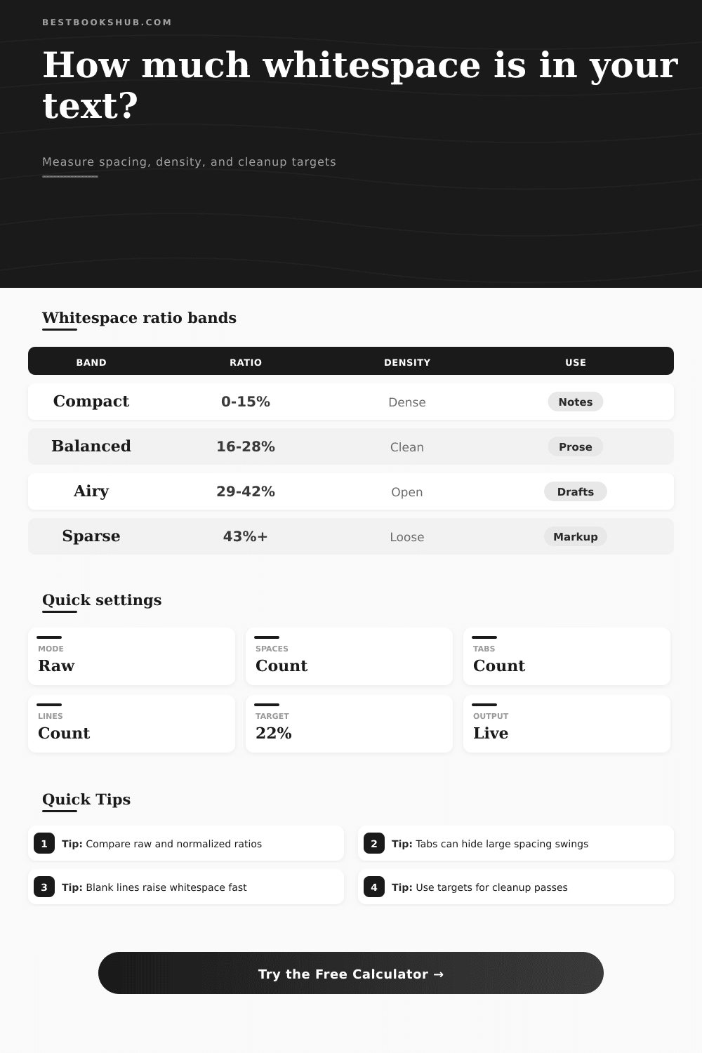
| Whitespace band | Ratio range | Common signal | Typical sample |
|---|---|---|---|
| Compact | 0-15% | Dense lines | Indexes, notes, code-like text |
| Balanced | 16-28% | Readable prose | Book pages, essays, articles |
| Airy | 29-42% | Loose layout | Drafts, poems, copied pages |
| Sparse | 43%+ | Spacing heavy | Markup, tables, OCR exports |
| Whitespace type | Calculator treatment | Why it matters | Cleanup clue |
|---|---|---|---|
| Space | 1 character | Word separation | Collapse repeats |
| Tab | 1-8 spaces | Indent width | Convert to spaces |
| Line break | 0-2 chars | Line structure | Set line weight |
| Blank line | By mode | Paragraph spacing | Collapse or keep |
| Text basis | Counts as text | Excludes | Best use |
|---|---|---|---|
| Visible | All non-space | Whitespace only | General density |
| Letters | A-Z letters | Digits, marks | Prose samples |
| Alnum | Letters, digits | Marks, spacing | Catalog text |
| Words | Word chars | Symbols | Draft cleanup |
| Sample type | Typical ratio | Watch item | Useful target |
|---|---|---|---|
| Novel page | 16-24% | Paragraph gaps | 20-24% |
| Study notes | 24-36% | Indent stacks | 22-30% |
| Poetry | 32-48% | Line breaks | Keep source |
| HTML copy | 35-60% | Markup padding | 18-28% |
If you’ve ever copied text from a web page and pasted it into an editor, you know how ugly it can be. There is big empty spaces on each line and strange indentations where there shouldn’t be any. Some of those white spaces are part of the structure of what you’re copying. Strip them all out, though, and they ruins the logic flow of your notes or squash the naturaly rhythm of your writing. The problem: do you have just enough whitespace? Too little? Too much? Spacing come up for most writers as an either-or problem. You have space or you don’t. But it’s not that simple in practice.
If text on a novel page has too much space between lines, the reader gets lost in a sea of white nothing. Too little and they get lost anyway because the text is so packed together. Study notes need space to help your brain separate out what’s important from what’s less important. The calculator let you measure this trade-off between visible text and spacing characters as a percentage, providing a real number to use rather than just going off gut feeling.
Why White Space Matters for Your Writing
A common source of confusion that trips people up is when they glance at their whitespace percentage and think “oh crap I have too much whitespace.” More times then not, the solution isn’t deleting content; it’s that you’re seeing formatting artifacts. A single tab character can represents four or eight spaces depending on context, which makes density metrics bounce around like crazy. To make up for this, the tool has an option for expanding all tabs to a constant width prior to running analysis. It’s a little detail, but it goes a long way towards making these numbers accurate.
Think about clean vs. Raw text. People copy paste from PDFs, or even export from their OCR software which pulls in invisible formatting like double spaces and hidden line breaks. The cleanup modes remove them so you can actualy see how dense your words are. Did it drop a lot when you cleaned? Your text is full of formatting noise, aka bloat. And this is what people get wrong. They think dense = good editing, but sometimes it’s just dense because it has broken formatting. Knowing the difference save hours of manual tweaking.
The ideal ratio depends based off context. A balanced ratio for ordinary text is typically somewhere between 16-28%. It’s high enough that pages appear uncluttered but not so high as to make them feel clutter-free. Because writers use extra linebreaks when writing to break up their thoughts (rather than cramming everything into paragraphs), drafts tend to be located at or beyond the airy range of over 30%. Below that are scripts and poems which can go as far as 40% or more. That doesn’t mean something’s wrong with yours: it means something’s right. On the page, the reference table explain all this and shows how your sample compare to standard layout patterns.
You should also consider how fast people will read it. More dense means they’ll have to scan quickly because their eyes aren’t getting much visual rest on every line. Airier text slows their eye down making them go more deeply into the text. You may want to adjust toward the upper limit of airy if you are writing a technical manual where the reader needs to process complex instructions. You may want to adjust toward the lower limit of tight if you are trying to keep the momentum going in a thriller novel. The calculator includes both your desired reading speed and words per page so you can see how much to add or remove to get result you want.
This isn’t a formula; don’t get obsessed with getting an exact figure. Think of these numbers more like diagnostics: check the raw ratio to see what you are dealing with, then run the cleaned version to understand your actual text density. Then compare the two. Where does whitespace begin? What formatting bloat exists? Tweak your design accordingly till it feels correct for the medium. White space isn’t empty till you know how it can best serve your reader. Do so with intention and your pages will breathe in all the ways that they should of.