📖 Reading layout lab
Words per line calculator
Estimate words per line, characters per line, total line count, and reading comfort from a sample passage and real layout settings.
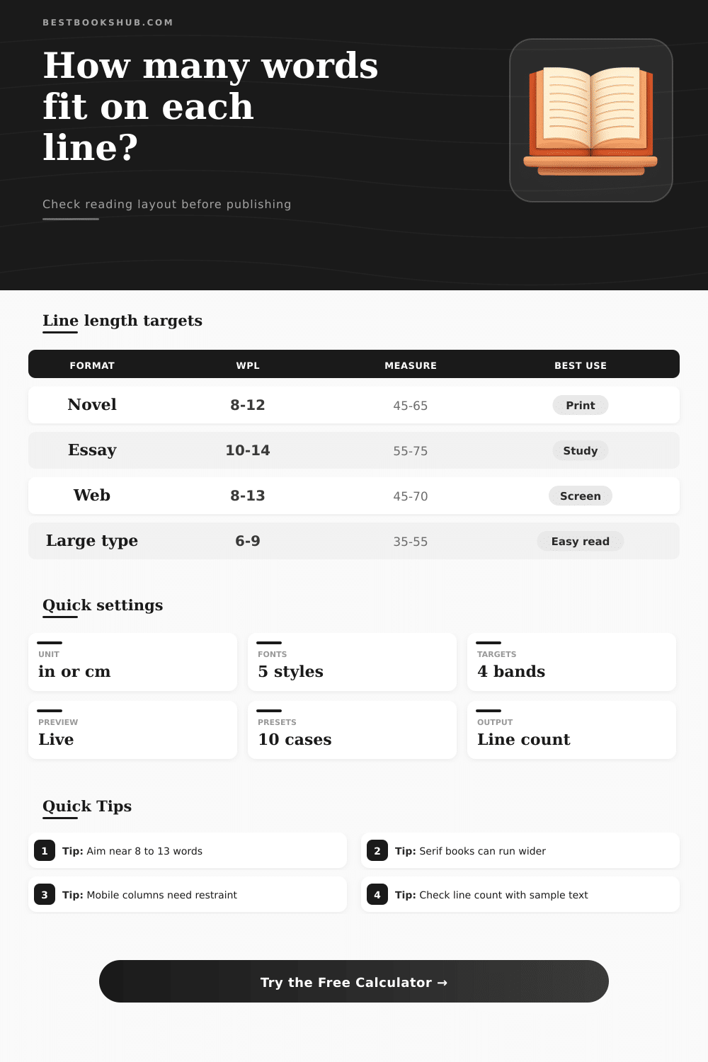
| Reading format | Typical words per line | Typical characters per line | Layout signal |
|---|---|---|---|
| Mass market paperback | 7 to 11 | 38 to 58 | Narrow but familiar for fiction. |
| Trade paperback | 8 to 13 | 45 to 65 | Balanced for long chapters. |
| Hardcover nonfiction | 10 to 15 | 55 to 75 | Works when leading is generous. |
| Academic essay | 11 to 16 | 60 to 85 | Dense but acceptable for study. |
| Web article column | 8 to 13 | 45 to 70 | Best for screen scanning. |
| Font profile | Average character width | Best match | Adjustment note |
|---|---|---|---|
| Compact serif | 0.45 em | Garamond-style text | Fits more words in the same measure. |
| Book serif | 0.50 em | Common novel typography | Good baseline for print estimates. |
| Wide sans or serif | 0.54 em | Readable web and trade layouts | Needs wider columns for the same WPL. |
| Monospace | 0.60 em | Code, scripts, manuscript review | Line length drops quickly. |
| Display face | 0.62 em | Pull quotes and headings | Not ideal for long reading blocks. |
| Page or container | Common text width | Likely WPL at 11 pt | Best use |
|---|---|---|---|
| 5 x 8 paperback | 3.7 to 4.0 in | 8 to 11 | Fiction and memoir chapters. |
| 6 x 9 trade page | 4.4 to 4.9 in | 10 to 14 | Nonfiction and general prose. |
| Letter manuscript | 6.0 to 6.5 in | 14 to 19 | Draft review, not final book feel. |
| Mobile content card | 2.8 to 3.4 in | 6 to 10 | Small screen reading. |
| Two-column article | 2.8 to 3.6 in | 6 to 10 | Magazine and report layouts. |
| Result band | Words per line | Reader effect | Layout response |
|---|---|---|---|
| Very short | Under 6 | Choppy rhythm and frequent returns. | Widen measure, reduce type, or use fewer columns. |
| Comfortable | 8 to 13 | Steady scanning and easy return sweep. | Keep as a strong book and web target. |
| Wide | 14 to 17 | Can work for essays with good leading. | Increase line height or narrow the column. |
| Too wide | 18 or more | Readers may lose the next line start. | Narrow the measure or raise type size. |
DISCLOSURE: This post may contain affiliate links, meaning when you click the links and make a purchase, I receive a commission. As an Amazon Associate I earn from qualifying purchases.
Now you’ll see that when you print out a chapter, it won’t look quite like how it did on-screen: Digital screens forgive; paper doesn’t. The words you’ve carefully crafted and smoothed over feel squeezed together (or far apart). They don’t read the same way.
Your eye doesn’t track text linearally. Instead, it makes little jumps called saccades. It jump from word to word and then back up to the beginning of the next line. When the jump back isn’t long enough, the eye slip. Too short and it becomes choppy, tiresome.
Why Line Length Matters for Reading
To do that, you need some way of measuring, such as a calculator I made that takes your page size plus your type size as input and saves you from guessing whether your draft will survive the transition to print. It turns out that line length is one of those things we think about based off a question of taste. It’s not. There are physiological limits to line length.
Specifically, there’s a range, typically somewhere between 45 and 75 characters wide (that the human eye find comfortable). Roughly speaking, this is about eight to thirteen words wide, depending on the font. Within that range, readers don’t even notice they’re doing the math, because their brains treat it more like a pattern then a series of separate items. They just read along comfortabley.
Outside of that range, however, they starts making mistakes. This happens even more in a long book of nonfiction or an essay, where they skip lines and get lost at the start of sentences.
Okay, what’s up with all this fuss about font selection? Turns out that a skinny serif such as Garamond holds far more characters on screen than a fat humanist sans-serif. Monospace fonts consumes significantly more horizontal space per character. You can account for this in the tool: it asks you to specify a font width profile that corresponds to the actual letter geometry you’re working with.
If you work mostly with monospaced fonts, think of all those manuscript and code being reviewed; you’ll know that each character take up far more horizontal room. Your only solution is to make your columns very wide indeed, or settle for short lines.
Poems have their own set of rules: poets frequently rely on narrow measures to establish pacing and add visual tension. A poem that needs white space around it will be smothered in typical book layout. You can tweak this in the calculator, so that your output follows not an arbitrary standard but a convention specific to your genre.
That’s why margins becomes key in all this. Margins establish the size of the reading space and prevent the text from bleeding off the edge of the page or screen. You can think of it as a way of shrinking how much “line length” there is to read. And sometimes that’s what you want.
Many trade paperbacks have generous margins so they feel open and encourage readers to stay awhile. By contrast, academic books frequently narrow margins to make the most efficient use of space (in terms of info density). They know their readers may get tired, but they is willing to take that chance to fit more stuff onto a single page.
As the chart below demonstrates, different formats have a tendency to settle out. Mass market paperbacks has narrower dimensions. Big print editions have larger spaces to allow for larger type sizes and to avoid making every line appear as if it were broken into bits.
Another factor in digital reading is that people read from all sorts of screens, ranging from smartphones to tablets to large desktop monitors. What appears like an ideal column width on your laptop might be too narrow (or too wide) on your phone, and look terrible across a widescreen TV. To ensure text is easy to read on any device, web designers limit their text containers to a set number of pixels. It’s sort of like print margin rules but adjusted to a fluid layout.
Using this tool, you can adjust the width of the container and play around with columns and line length, what happens if you have one block of text versus two? Could of you guess how it will appear in various contexts so that when you do choose a design, it will hold up?
Good typography, in other words, is invisible. If all goes well, the reader becomes unaware of margins and line length and font size, because they’re focusing on the argument or story instead. You don’t want to introduce friction; you want to remove it. These tweaks, these adjustments to line length and margin and font size. Smooth out the eye’s path.
So often the distinction between a good book and a great one is made up of these quiet technicalities. Spend some time double-checking your layout. Your readers will thank you by spending more time on the page.